


CHALLENGE
For years, public programming at The New York Public Library consisted mainly of poetry readings, historical lectures, chamber music, and lots of white septuagenarians. Catering to only this tiny sliver of the public was severely limiting to the NYPL. To live up to its mission it needed to expand its service to a far more diverse demographic. It was also missing opportunities to target younger groups as a donor base.
To that end, the feisty Paul Holdengräber was brought in as program director. His mandate was to turn programming on its ear; to “make the Lions roar.” LIVE from the NYPL was born. To ensure that communications started off with a bang, a new visual identity was required.
PROCESS
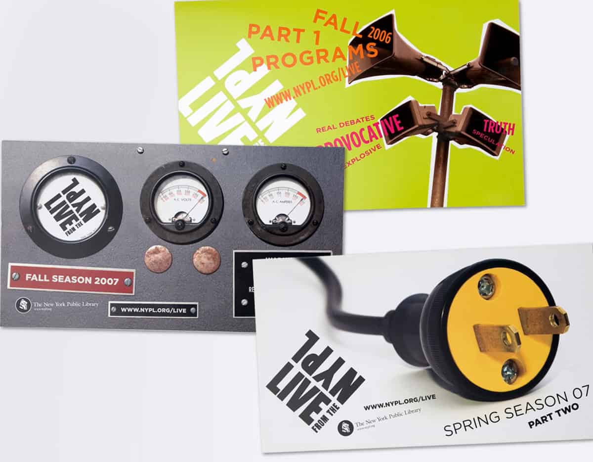
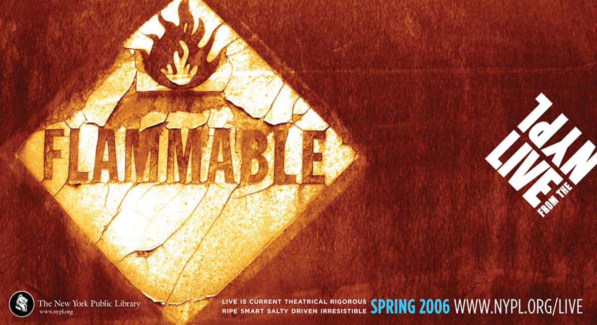
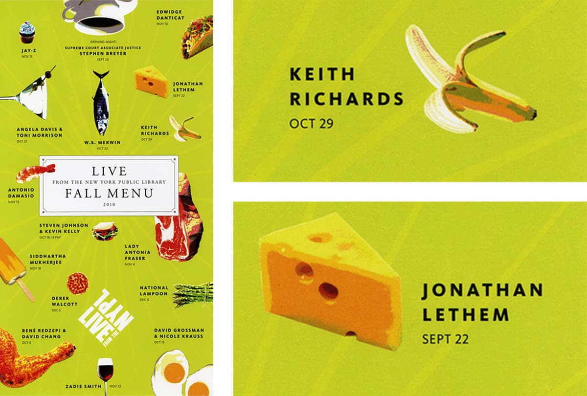
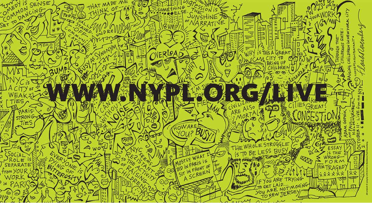
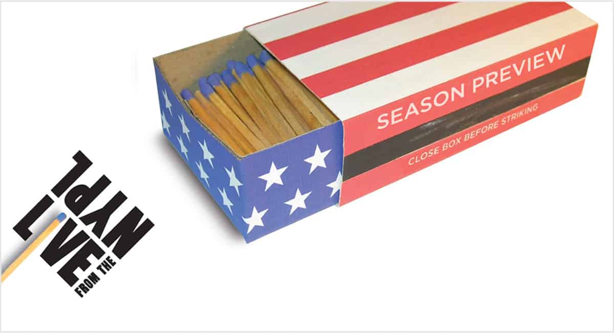
LIVE events would take the form of of debates, interviews, readings, performances, and even discussions combined with games of ping-pong. Their aim was to be provocative, intellectually rigorous, occasionally controversial, and engaging to audiences and participants alike. To be sure, this was a radical departure from the NYPL’s normally staid image. At the first meeting Holdengräber proclaimed of the graphic design, “Let’s put wasabi in it!” It was the perfect metaphor: an unmissable pinch of eye-opening delight.
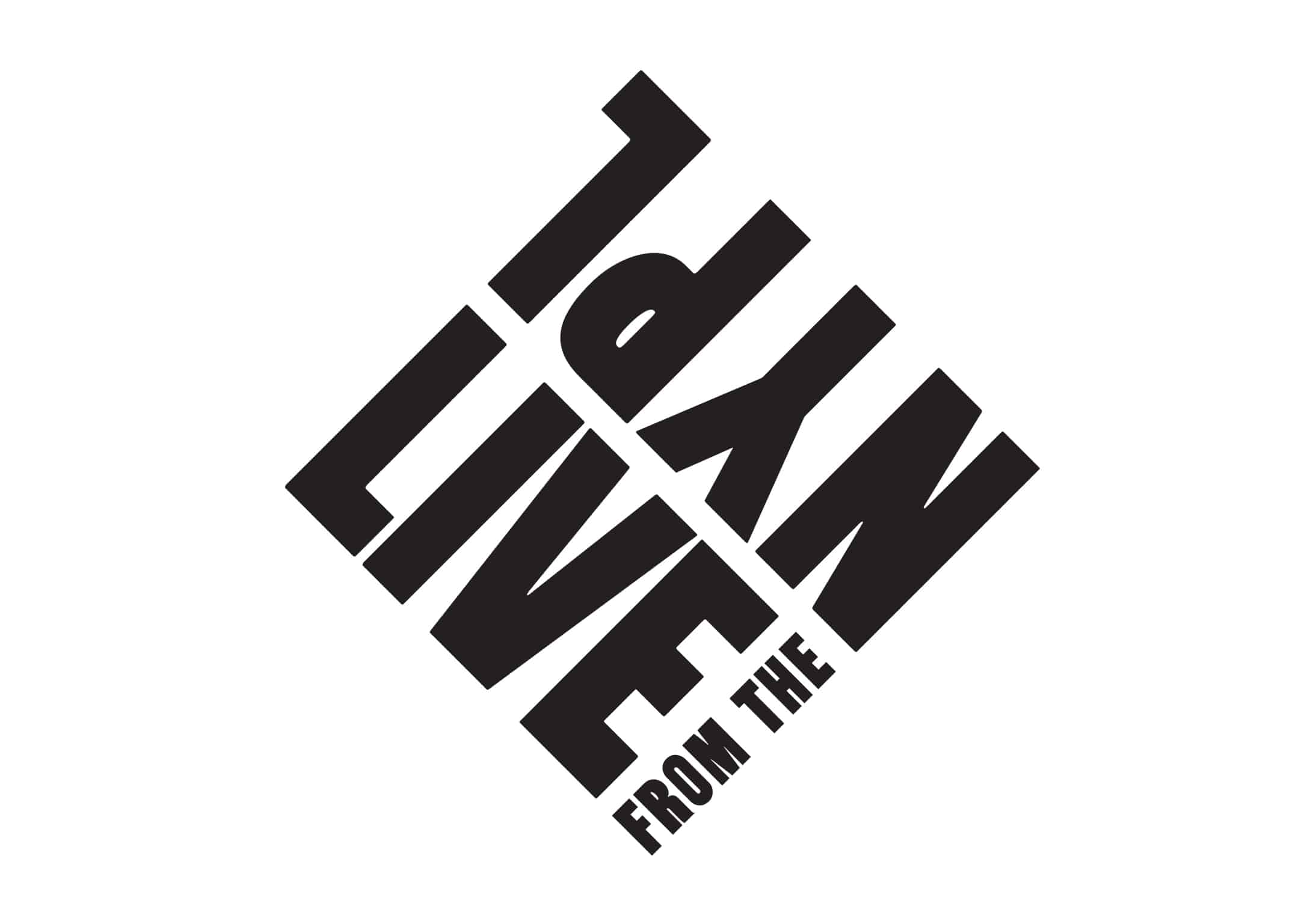
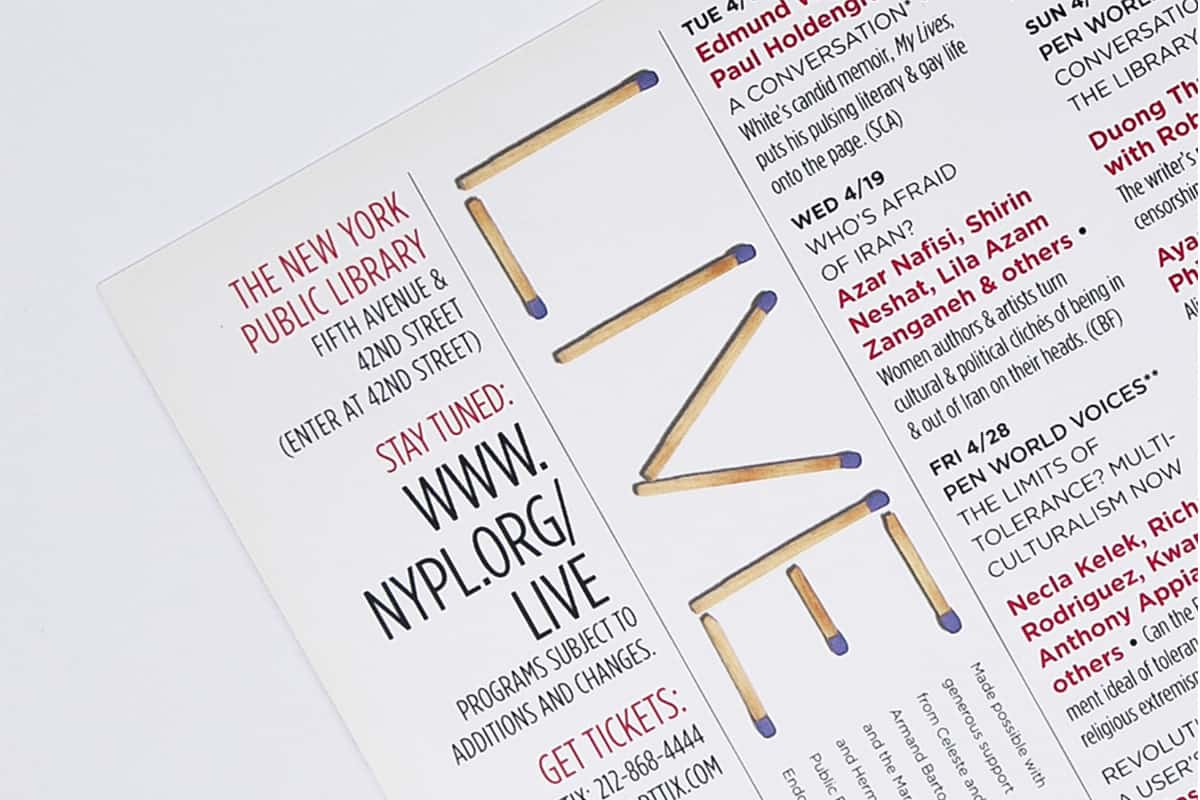
I developed the LIVE logo first. It needed to be simple and bold and speak of momentum. Simultaneously, we explored a variety of unorthodox imagery conveying concepts of heat, electricity, and grittiness. Since LIVE would question what the Library and its programs could be about, we wanted to evoke an almost countercultural feeling.
In keeping with the experimental nature of LIVE, there would only be minimal design parameters — the aim was to keep each piece fresh, even if it meant less visual consistency, and let the identity morph over time. To this end, the LIVE logo — and later, an acid green color — were the only required elements.
RESULTS
LIVE’s curious and arresting promotions helped lead the programs to unprecedented exposure. Publicity and media coverage skyrocketed. Programming at the organization had never seen such attendance: the first year alone saw a 25 percent increase, and within the first five years audiences had had grown by more than 200 percent. They were also now younger and more diverse, both racially and economically.
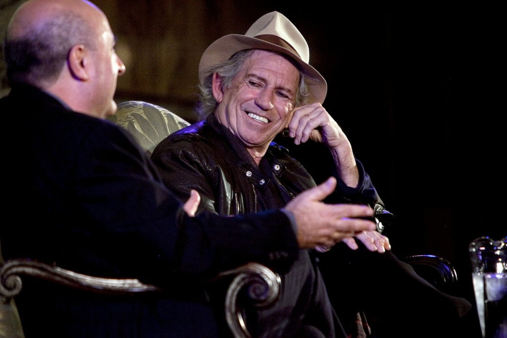
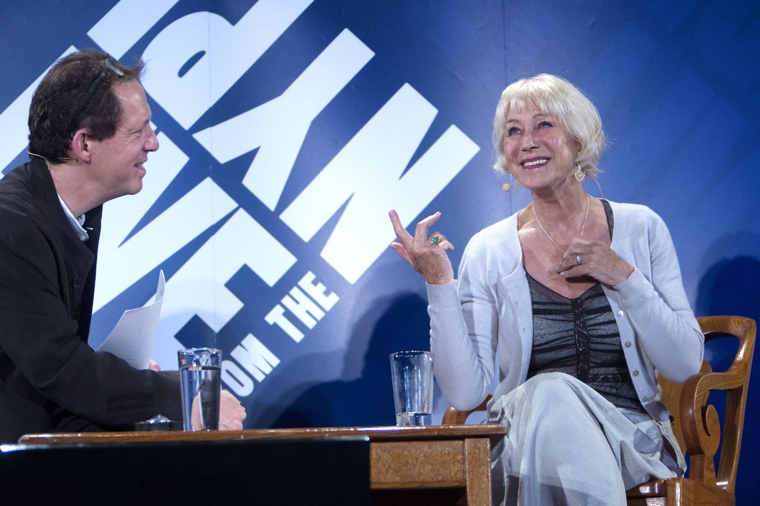
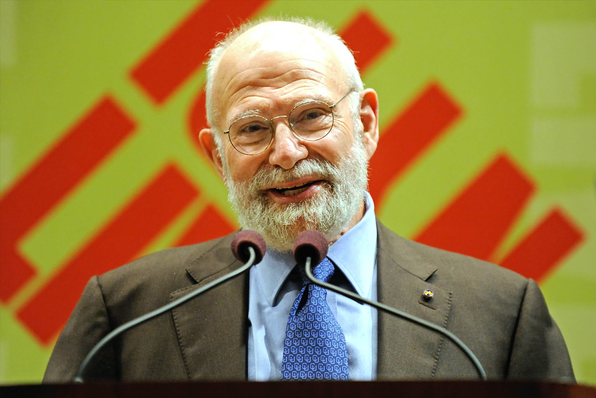
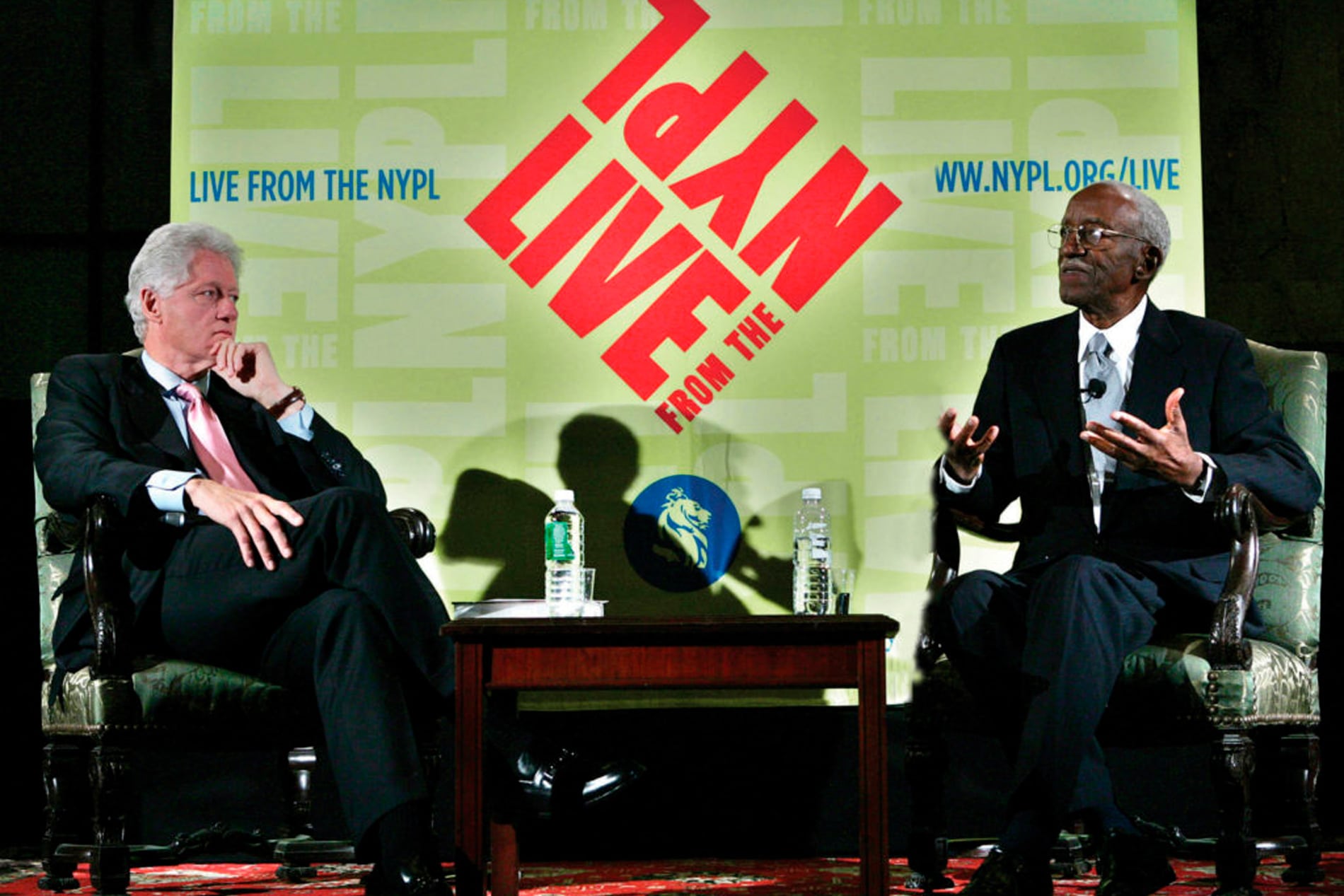
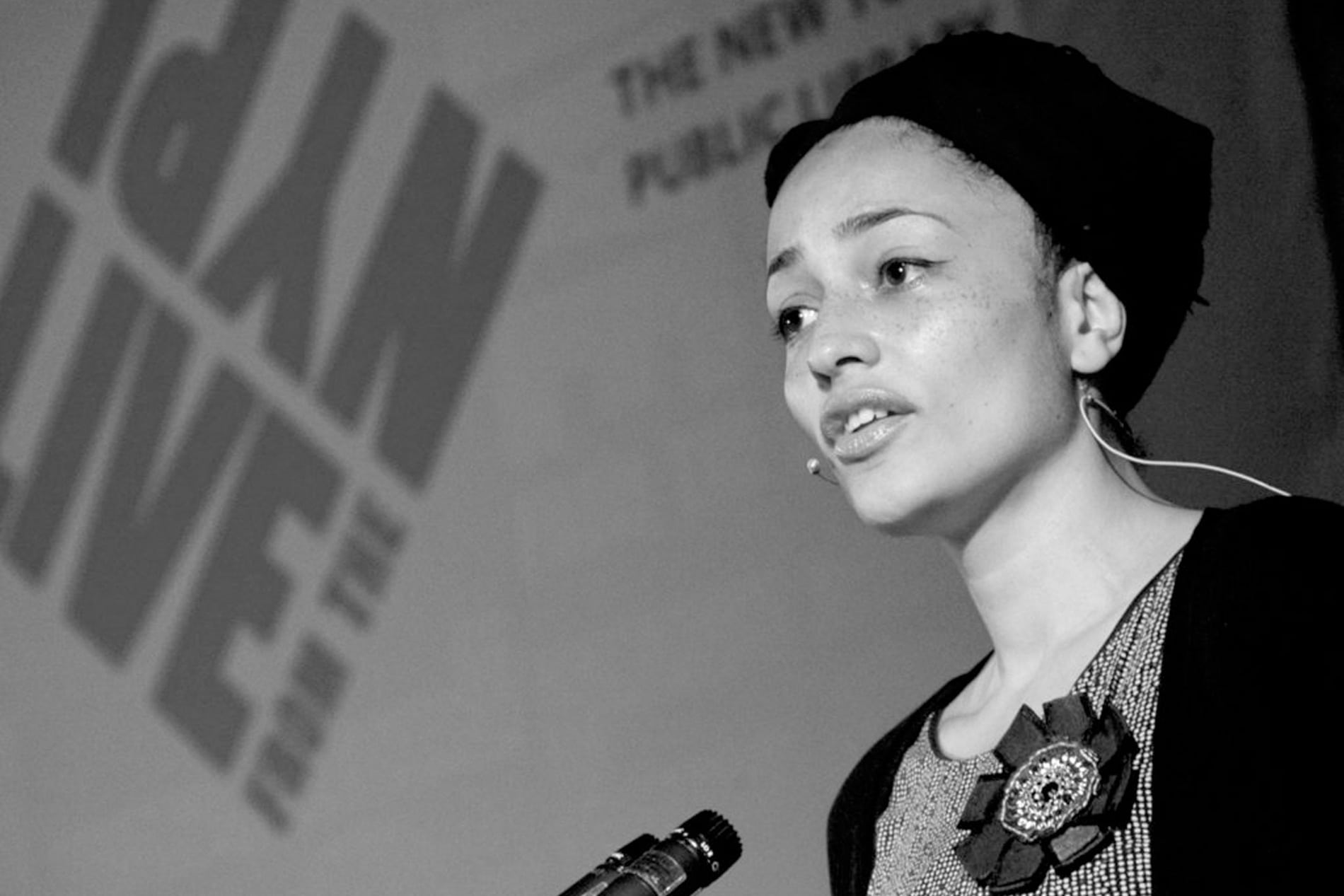
LIVE’s list of high-profile figures snowballed as its reputation grew. A small sampling of cultural icons included guests such as Margaret Atwood, David Byrne, Bill Clinton, Joan Didion, Umberto Eco, Frank Gehry, Barbara Kingsolver, Jay-Z, Fran Lebowitz, Spike Lee, Toni Morrison, Haruki Murakami, Lou Reed, Keith Richards, Salman Rushdie, Oliver Sacks, Elizabeth Gilbert, Newt Gingrich, Werner Herzog, Al Sharpton, Patti Smith, and John Waters. The Library was apparently now The Place To Be.
. . . . . . . . .
SERVICES
Creative direction | Graphic design | Branding/Identity | Illustration | Photography
TEAM
Creative direction & design: Marc Blaustein
Additional design: Ann Sappenfield, Kara Van Woerden, Katharina Seifert

