


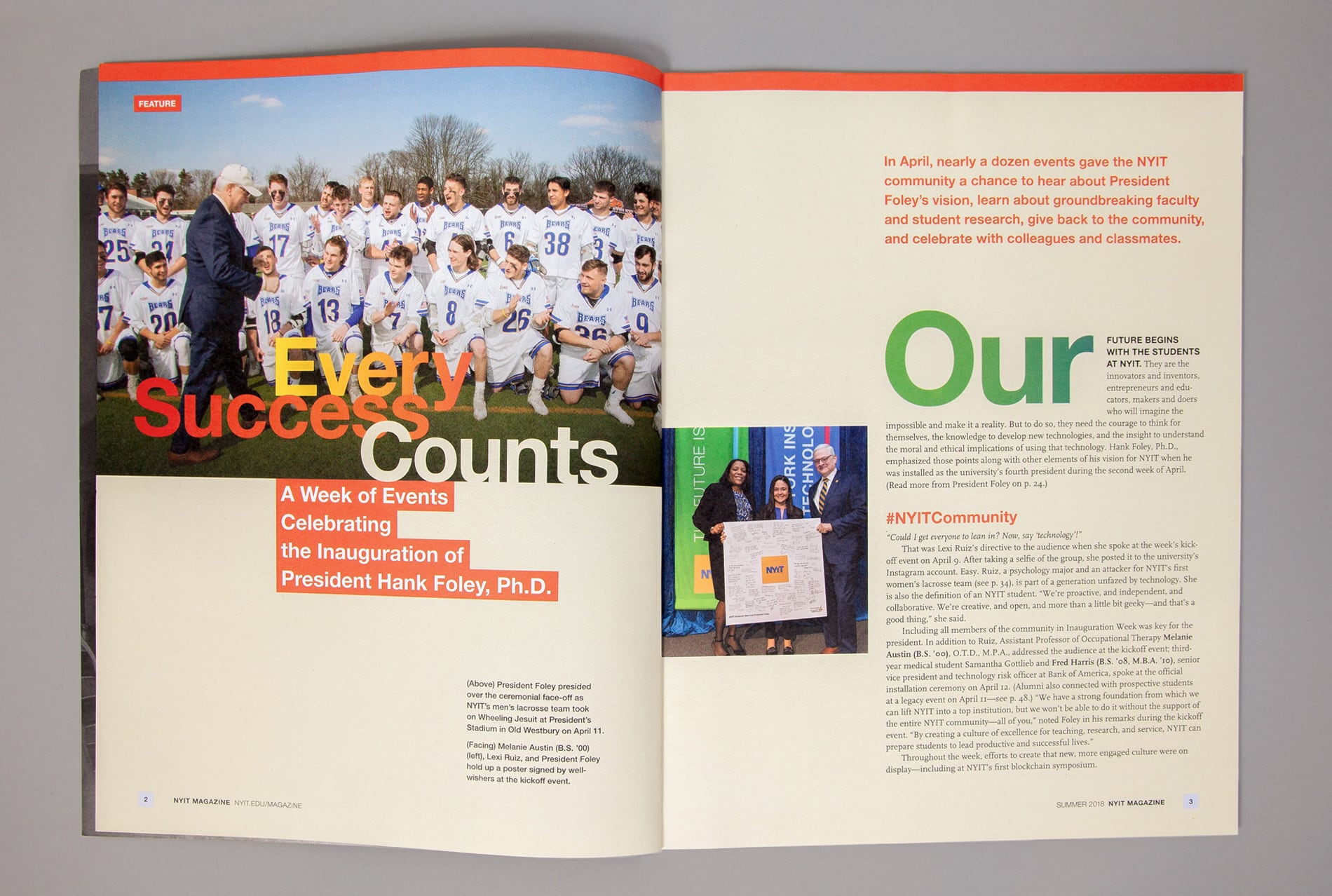


CHALLENGE
New York Institute of Technology (NYIT) is a global university with campuses in the U.S., Canada, China, and Abu Dhabi. Offering 90 undergraduate, graduate, and professional degree programs, the school attracts more than 9,000 students worldwide from roughly 100 countries. Fields of study include architecture and design; arts and sciences; education; engineering and computing sciences; health professions; management; and osteopathic medicine.
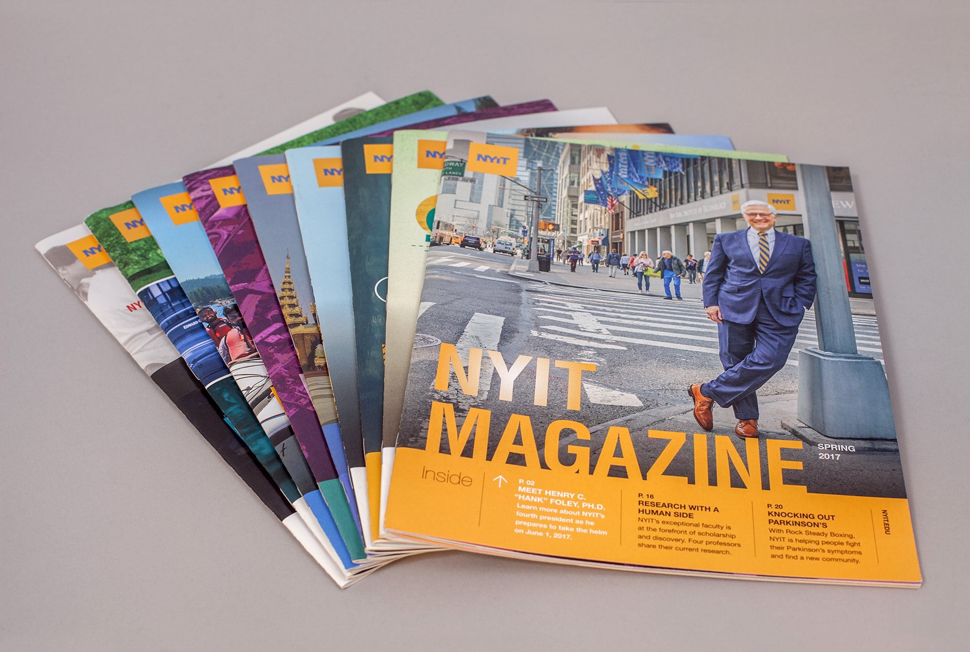
One of NYIT’s most important tools for outreach to its alumni is NYIT Magazine, published three times a year. The publication was in need of a radical update to compete with alumni magazines from other schools in the marketplace. Not only was the design outdated, but a new, progressive approach to written content required a contemporary presentation. The magazine needed to expand in order to better connect with alumni and appeal to current and prospective students and parents. It also needed to function as a fundraising tool to encourage alumni giving, and to entice corporate partners by proving to them the value of backing such an organization.
PROCESS
The new design solved a variety of issues:
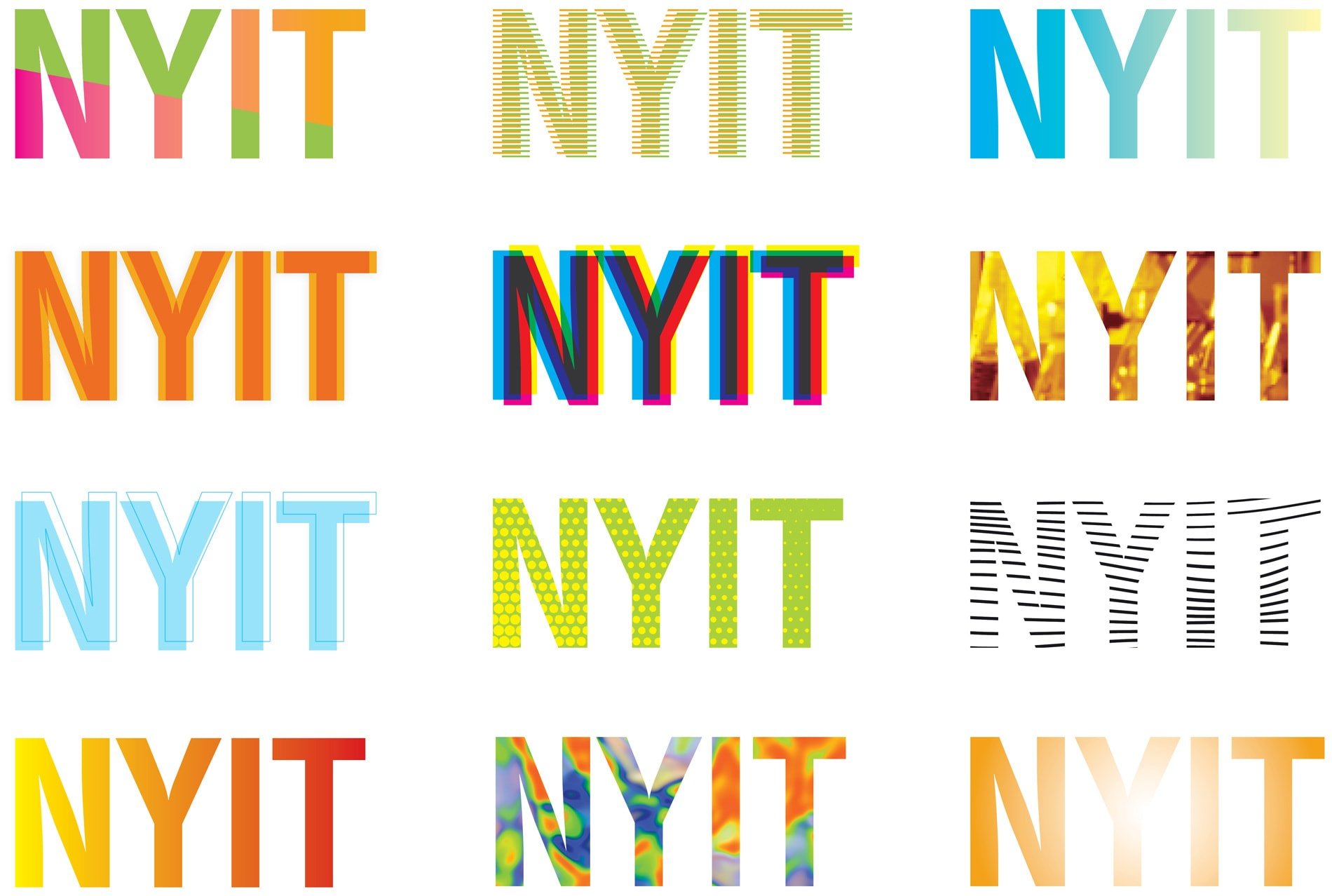
• The school had recently revamped its visual identity. We introduced new fonts and colors to complement a variety of the school’s newly-branded collateral.
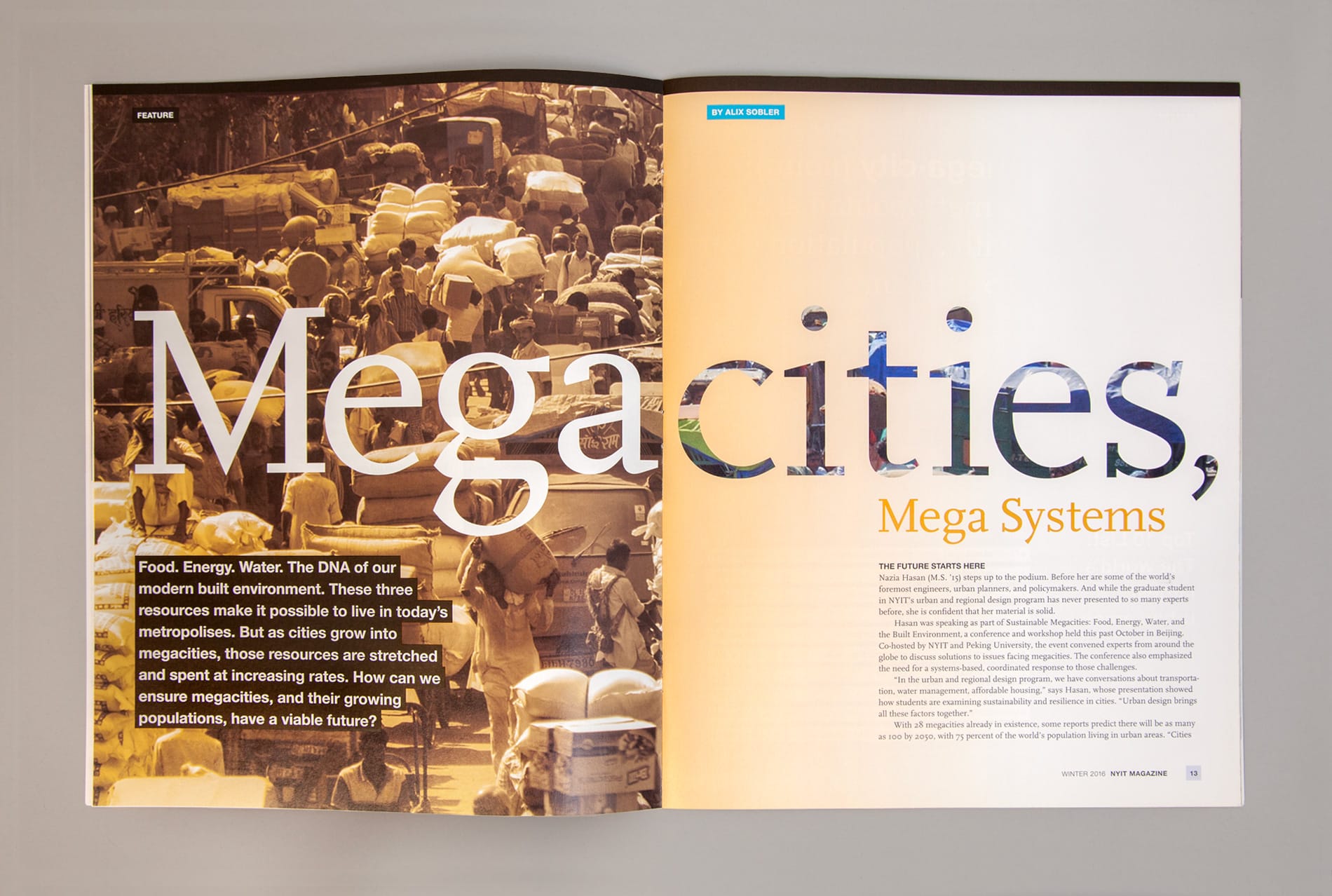
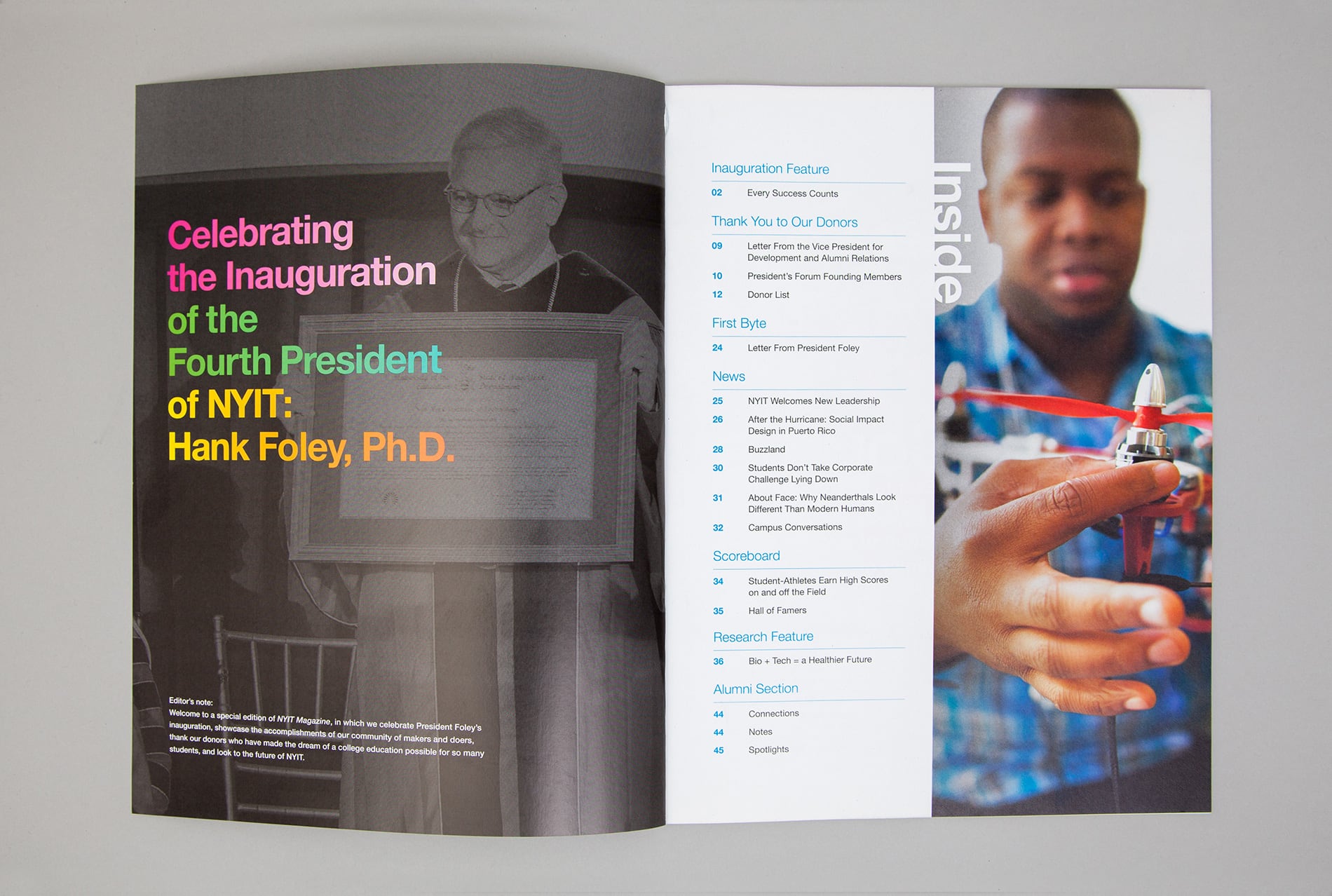
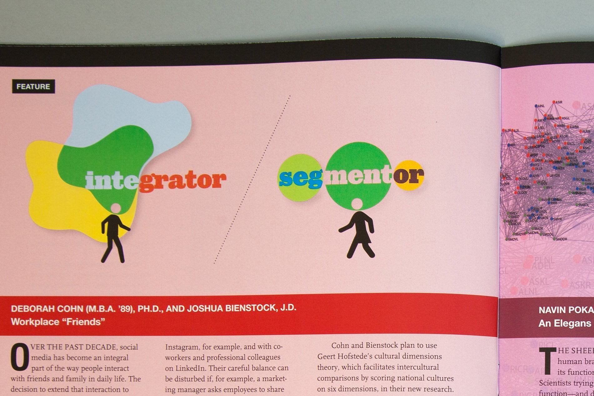
• Readability was key. I created a new design that would appear fresh and dynamic while remaining intuitive to navigate and read.
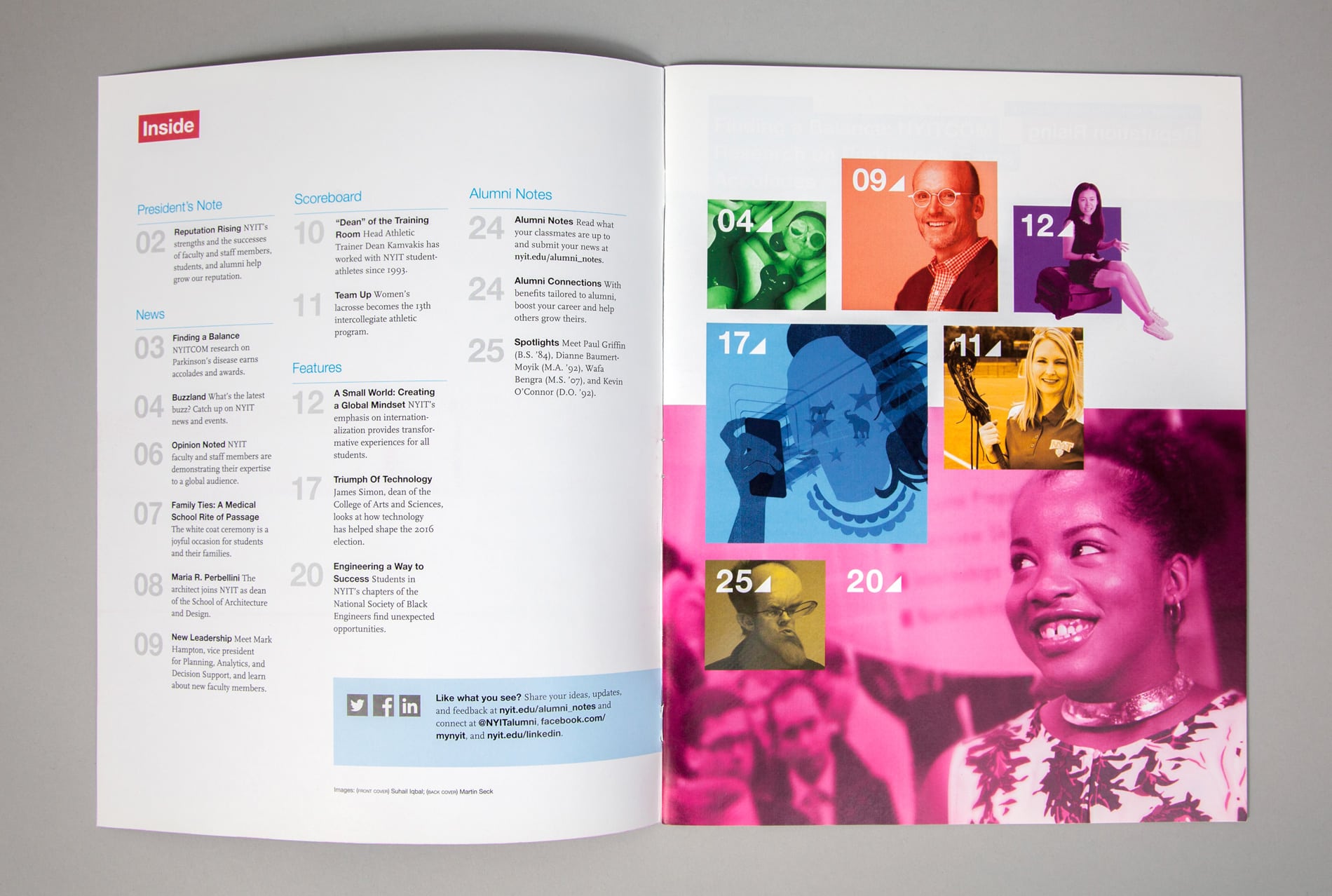
• Clear design parameters were essential. I developed a flexible grid system that allowed for a wide variety of page layouts with a consistent visual language.
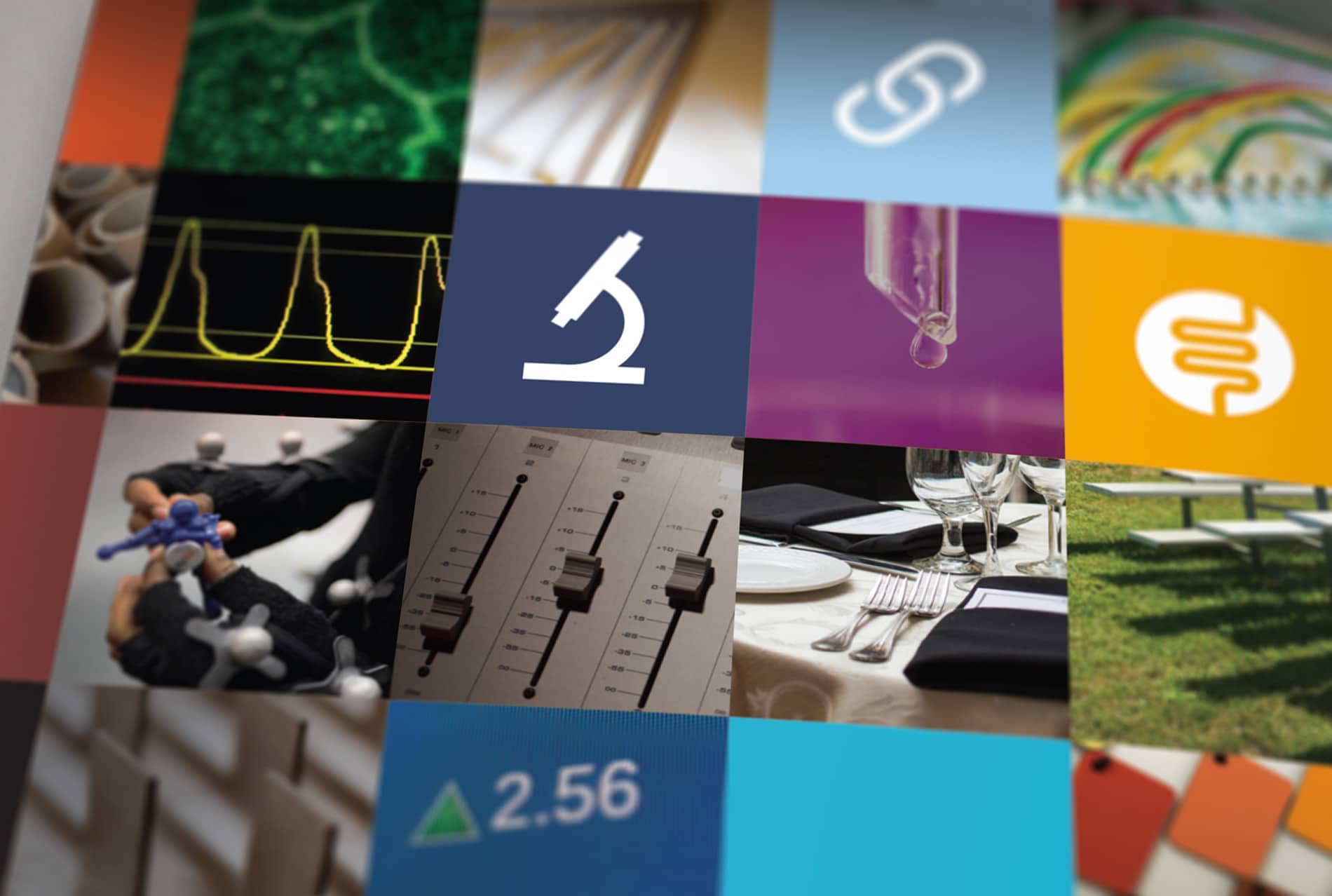
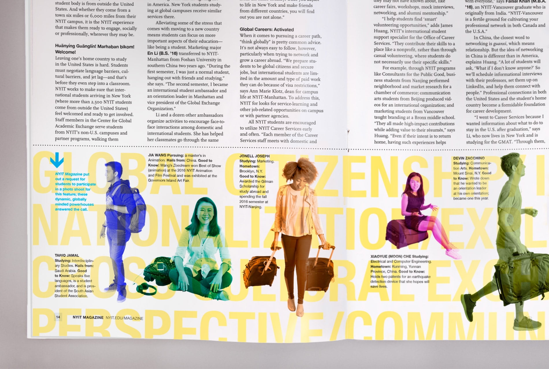
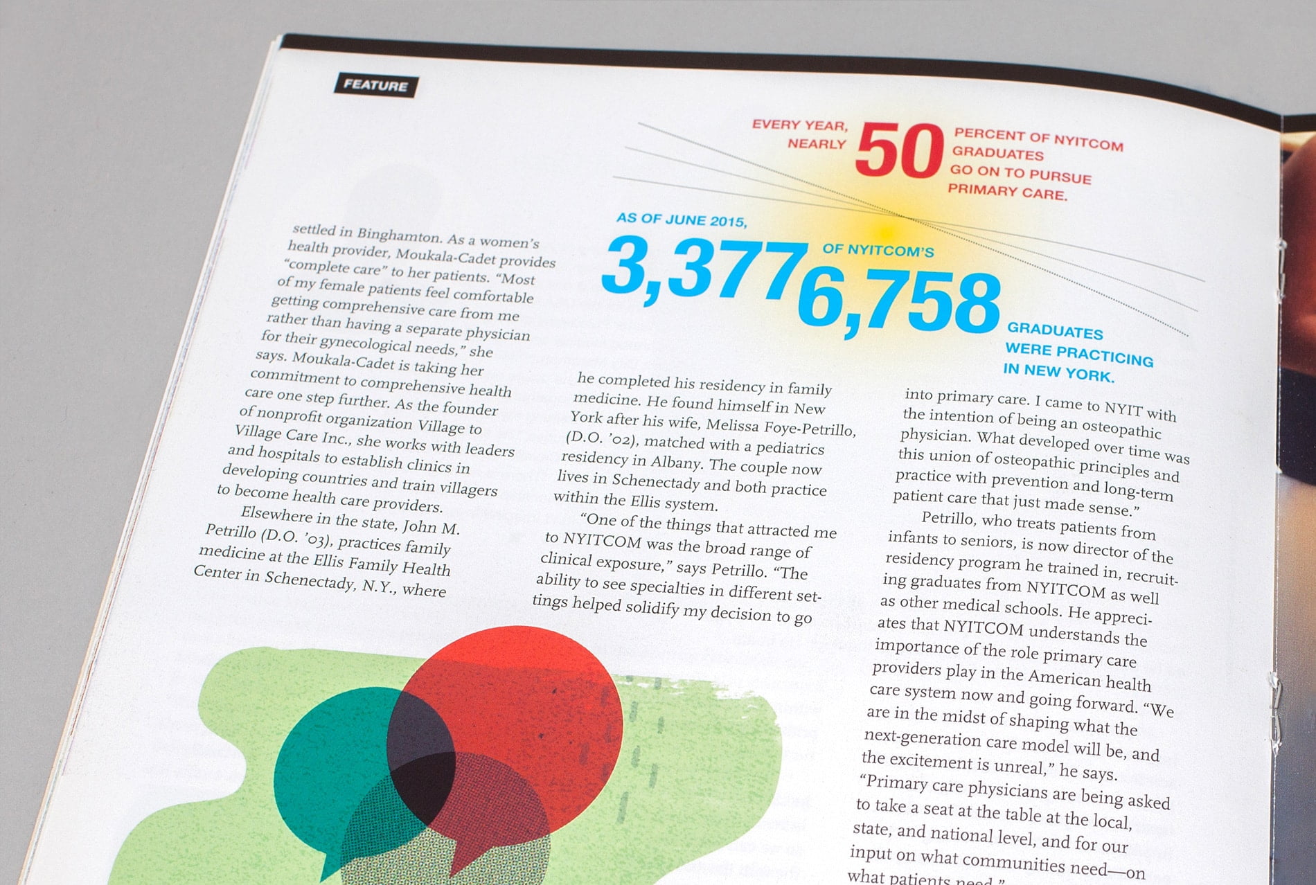
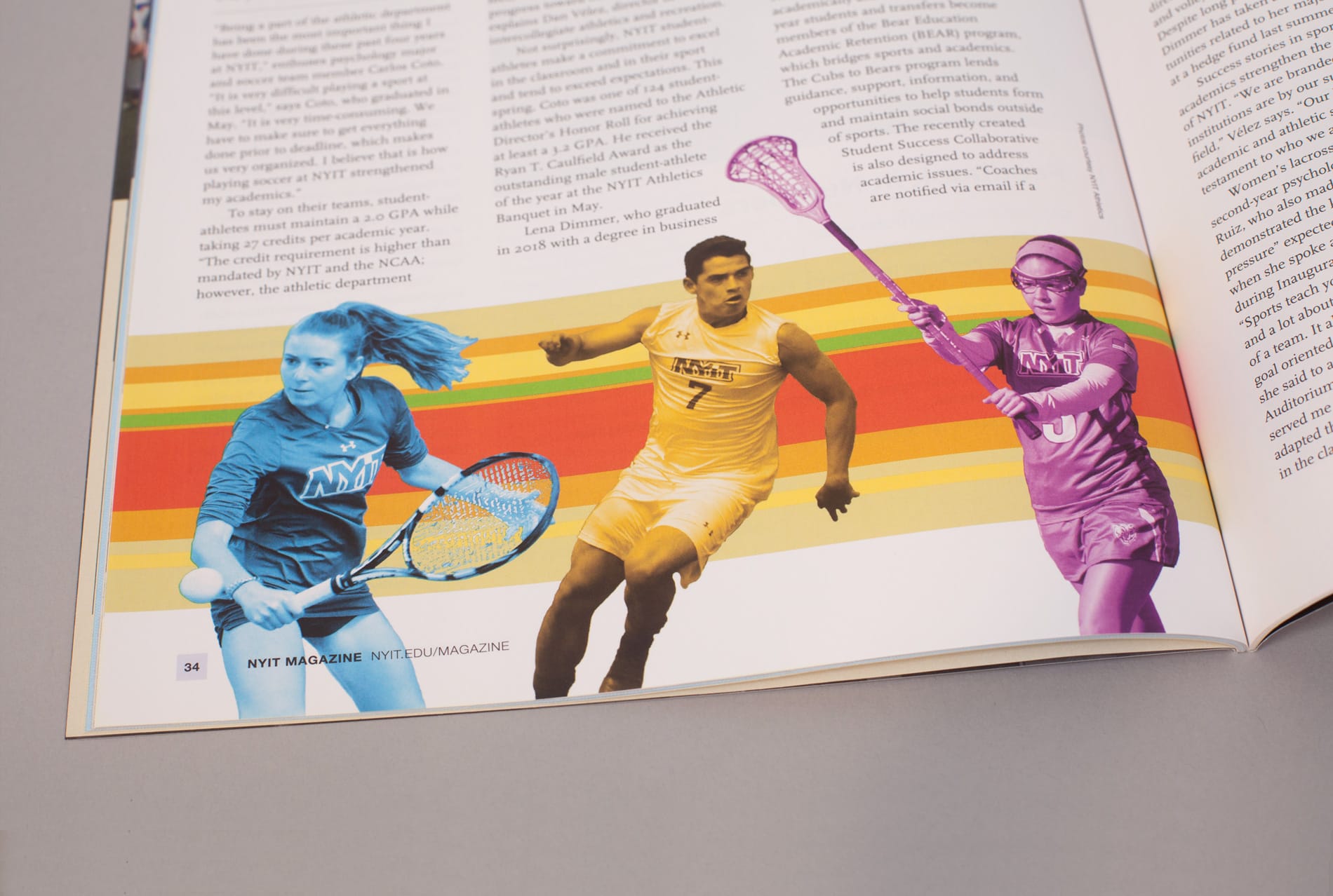
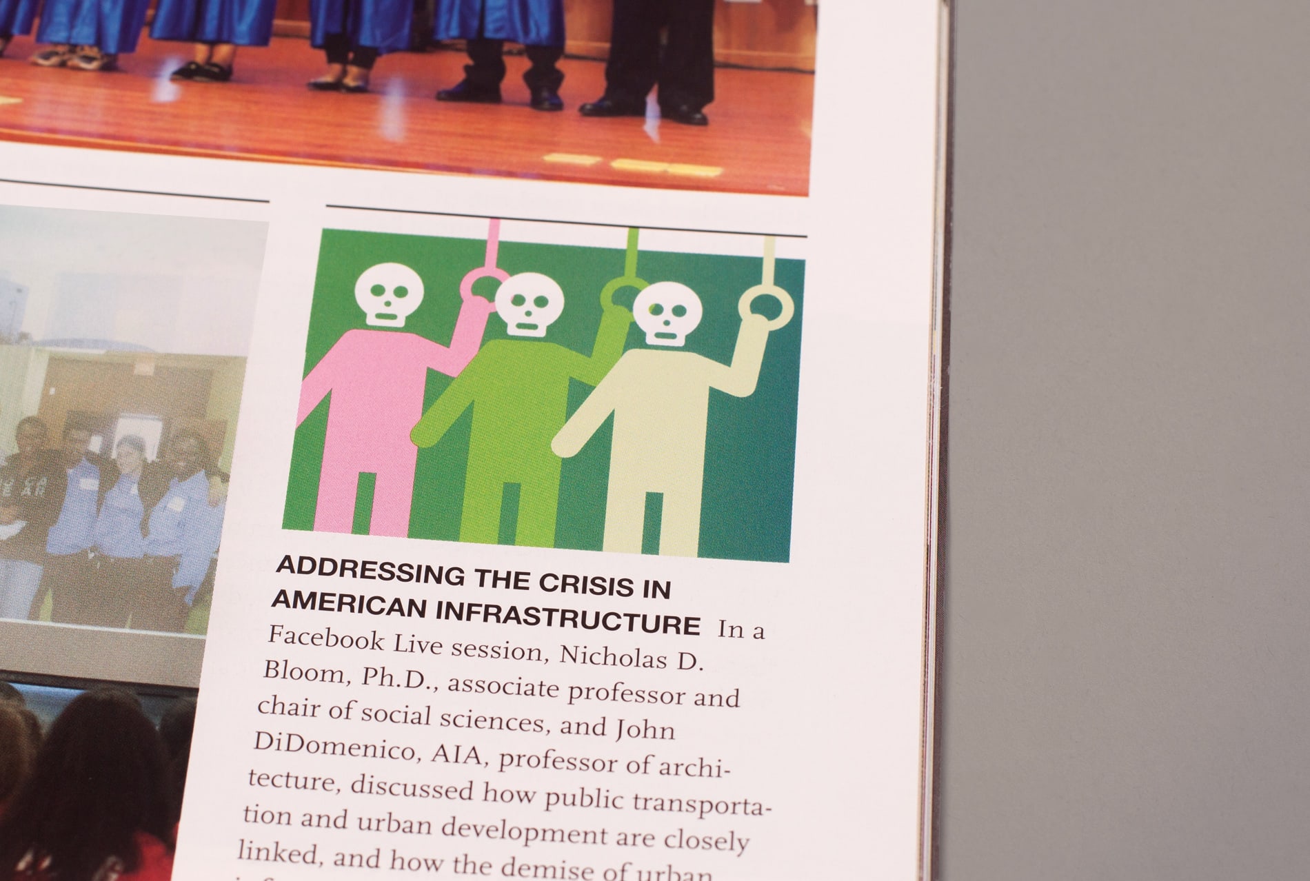
• Images required a unifying approach. Since the magazine would use professional and amateur images from a wide variety of sources, we employed monochrome and duotone photographic effects. This technique dramatically improves the look of amateur photographs while creating a consistent look and feel.
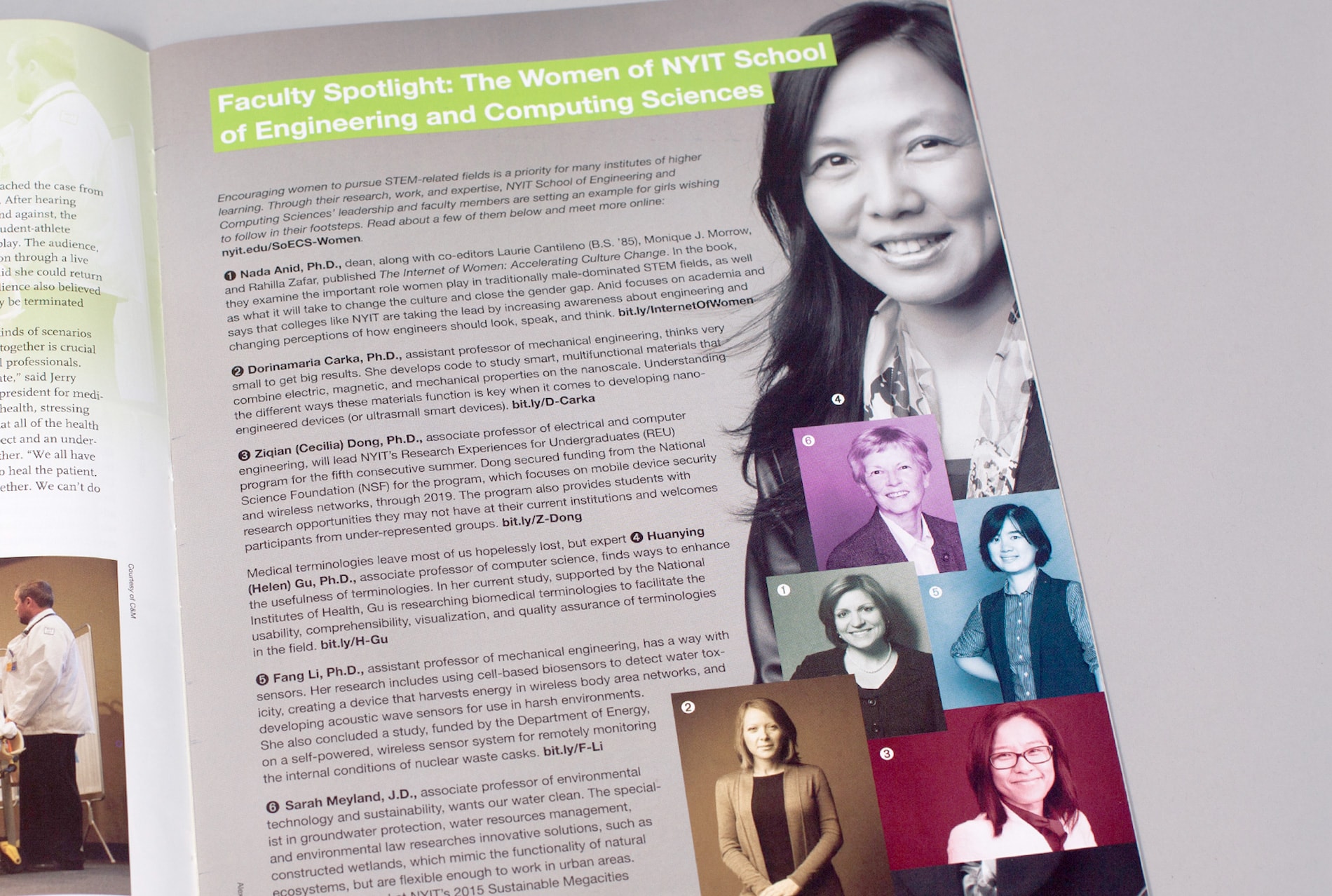
• I addressed photographic subjects and aesthetics by creating a style guide to inform professional and amateur photographers about the “NYIT Magazine look” — images of people interacting with one another in dynamic yet authentic ways.
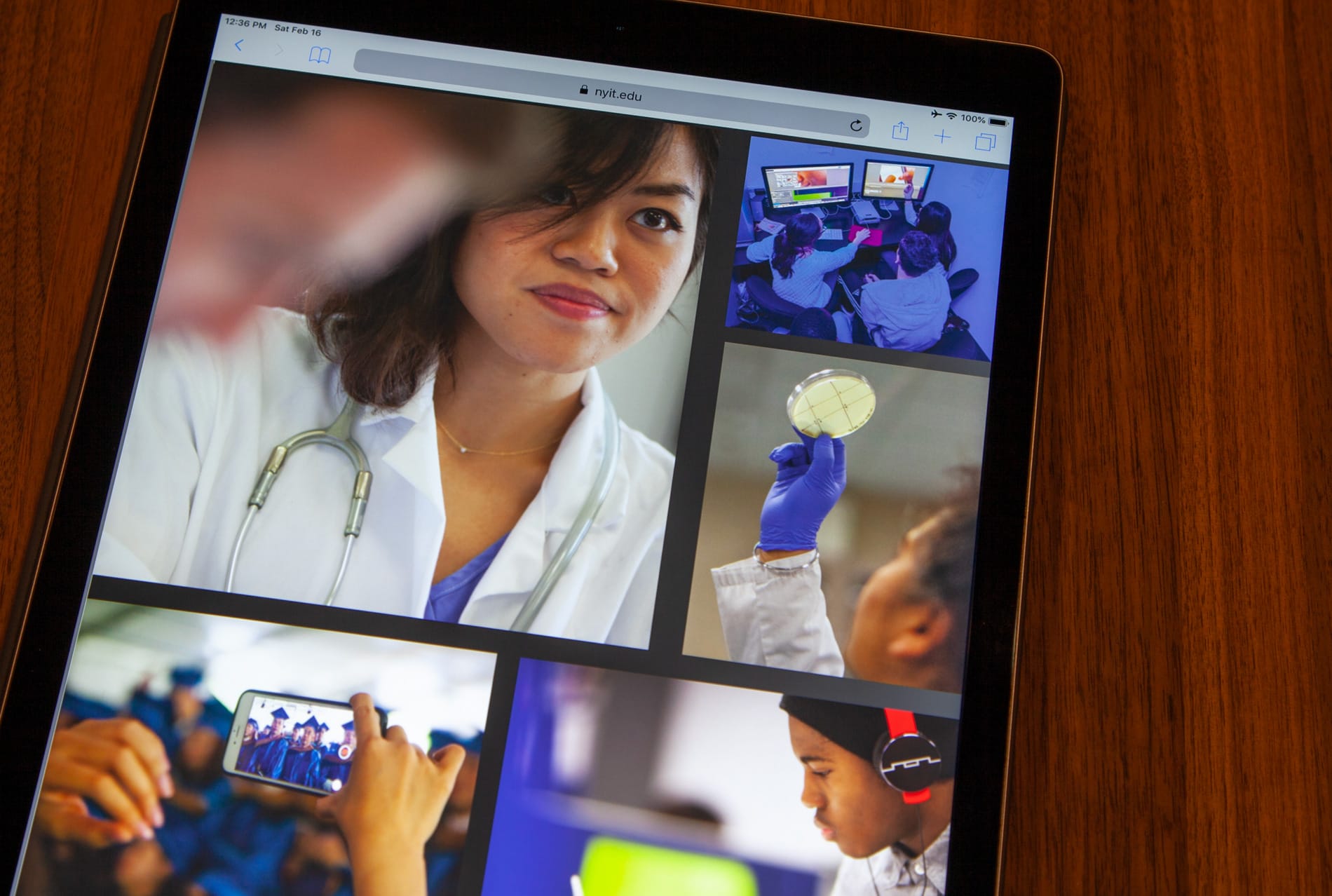
• To accommodate digital publishing, we developed a production workflow that would seamlessly translate into an online format. For each issue we created an interactive Issuu publication, complete with live links throughout.
RESULTS
In reader surveys, 93% of magazine recipients favored the redesign. The new design helped raise NYIT’s profile as a progressive institution fostering world-class, forward-thinking education. The magazine can now more effectively share stories of how graduates have become leaders in their fields and made an impact — and invite prospective students to do the same. It has become an essential tool for fundraising, recruitment, and alumni, student, and staff relations.
. . . . . . . . .
SERVICES
Art direction | Print and interactive digital publication design | Illustration | Design for social media

