
CHALLENGE
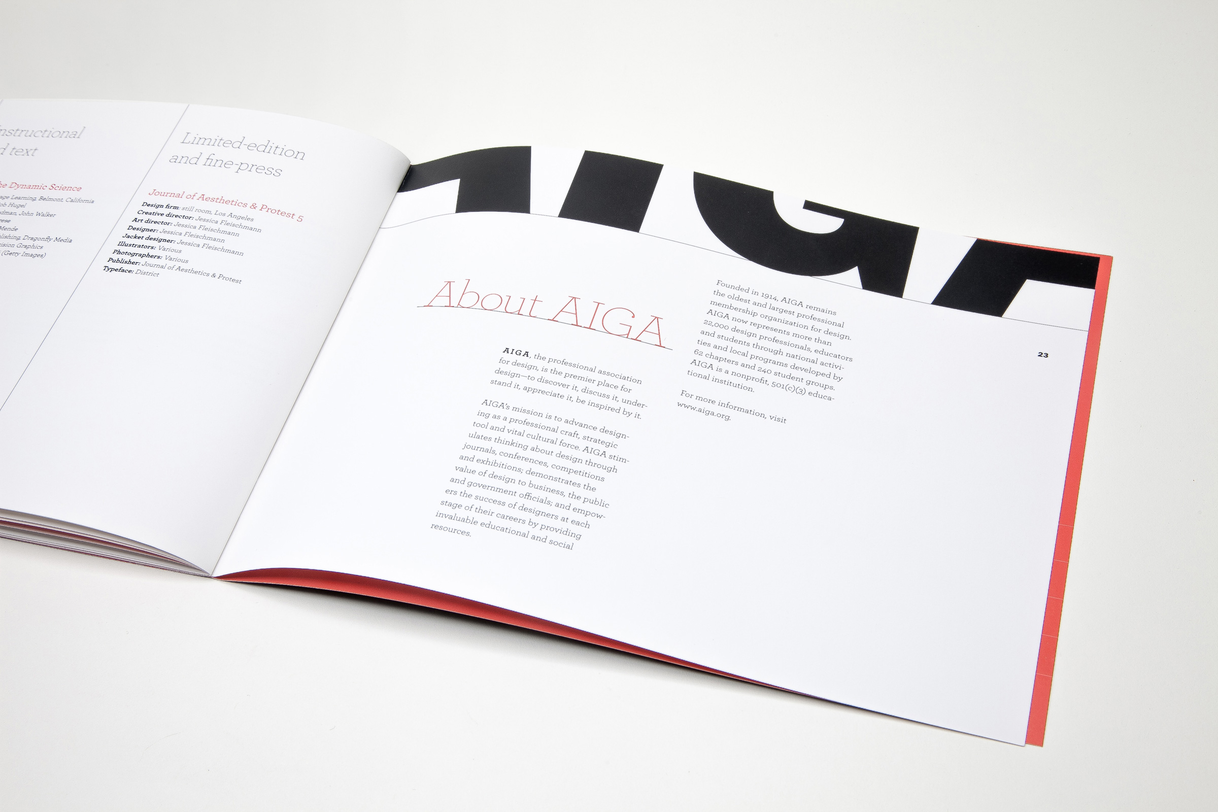
With more than 18,000 members worldwide, the AIGA, the professional association for design, is the world’s largest and oldest organization of its kind, and a beacon of excellence and professional standards. So, after serving as one of four judges for their annual “50 Books/50 Covers” competition, it was a particular honor to be chosen to design the accompanying exhibition and graphics.
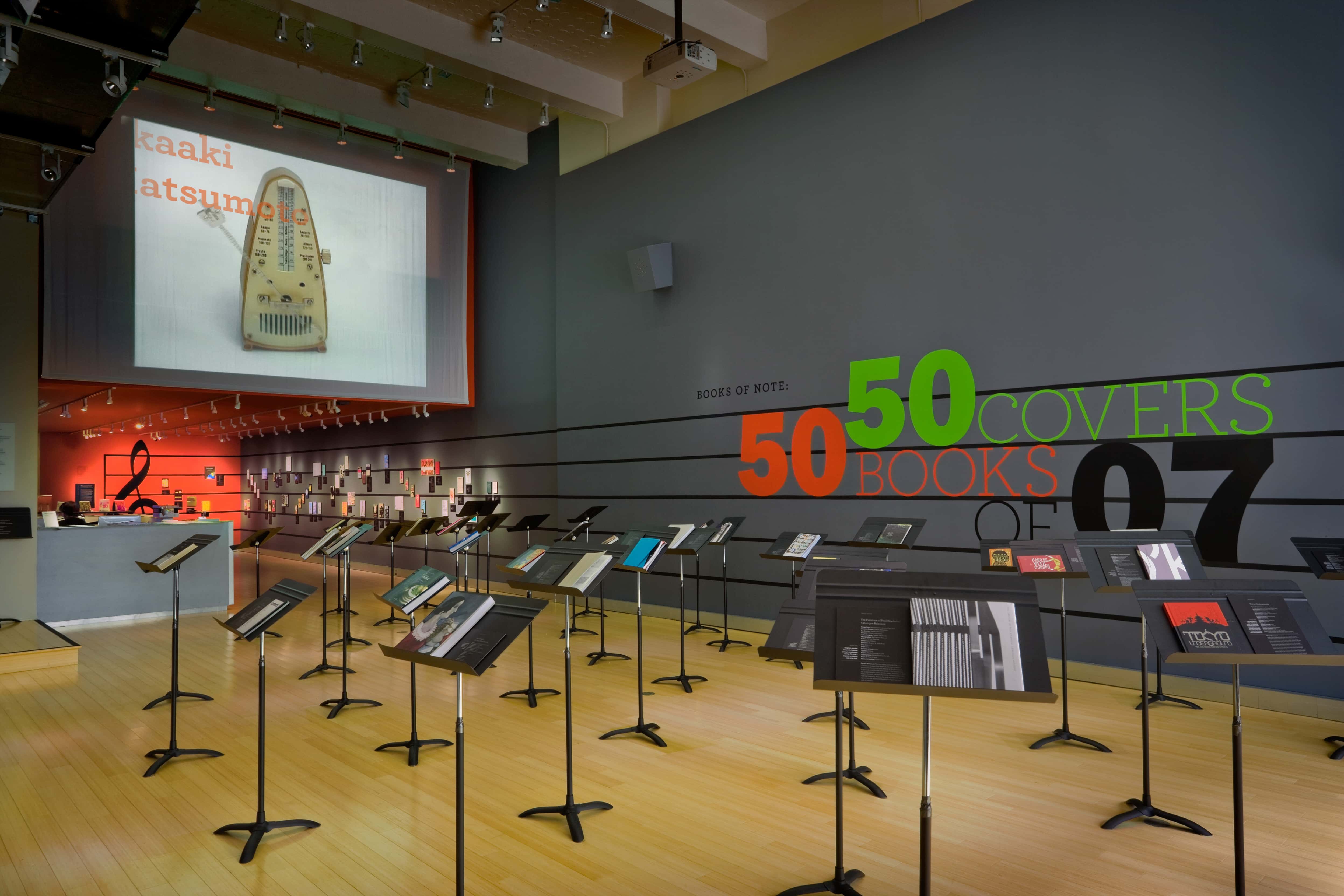
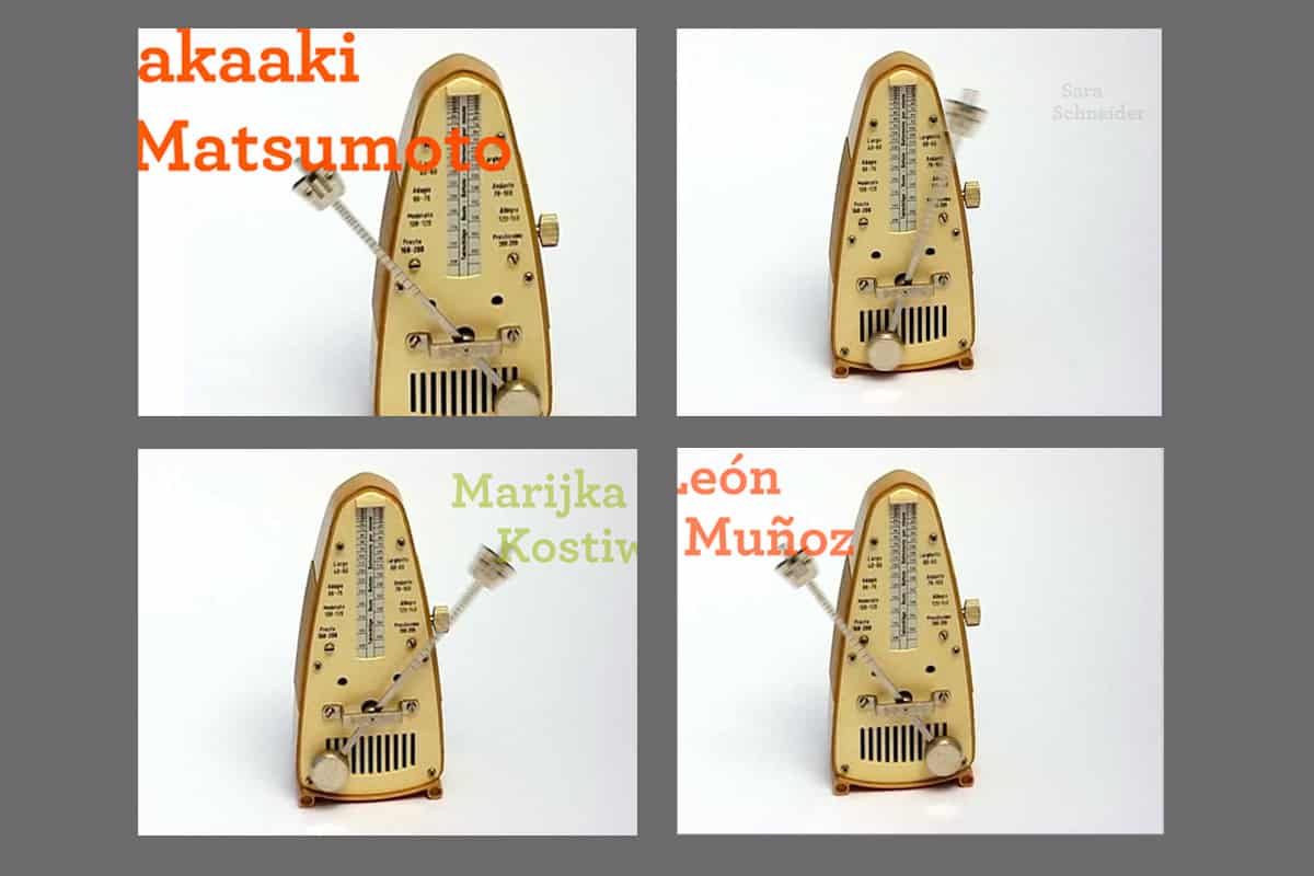
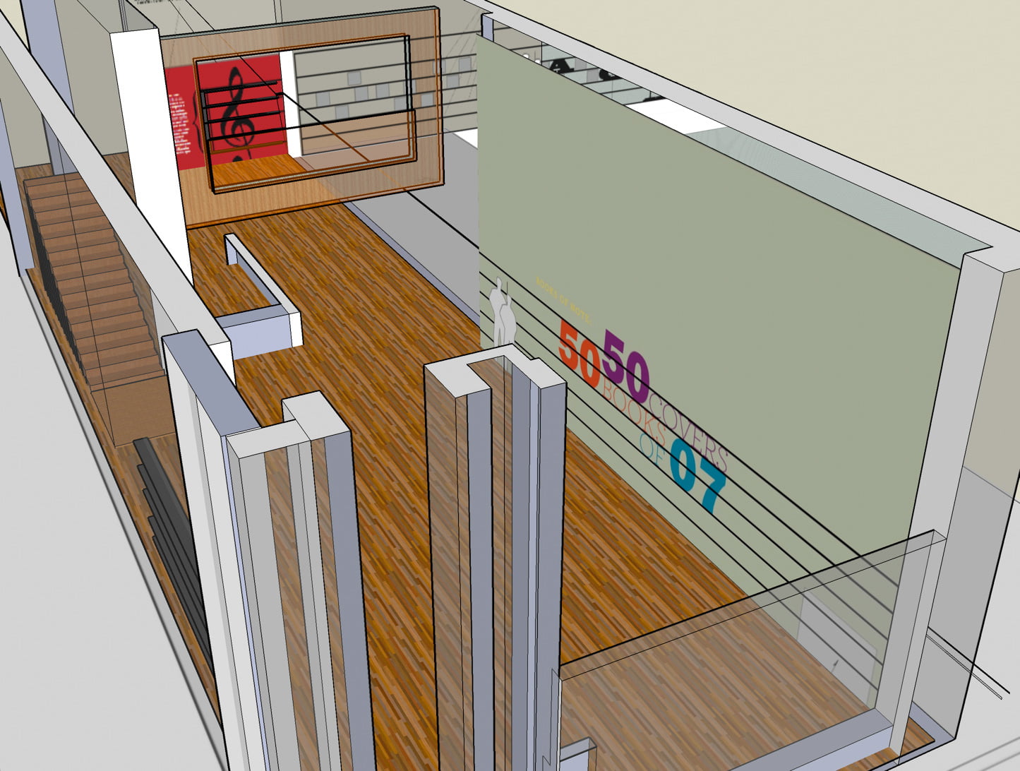
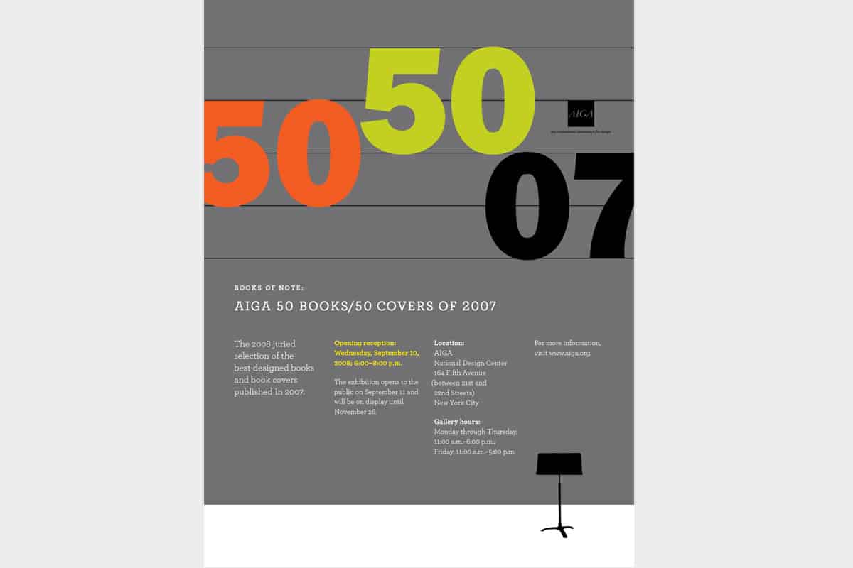
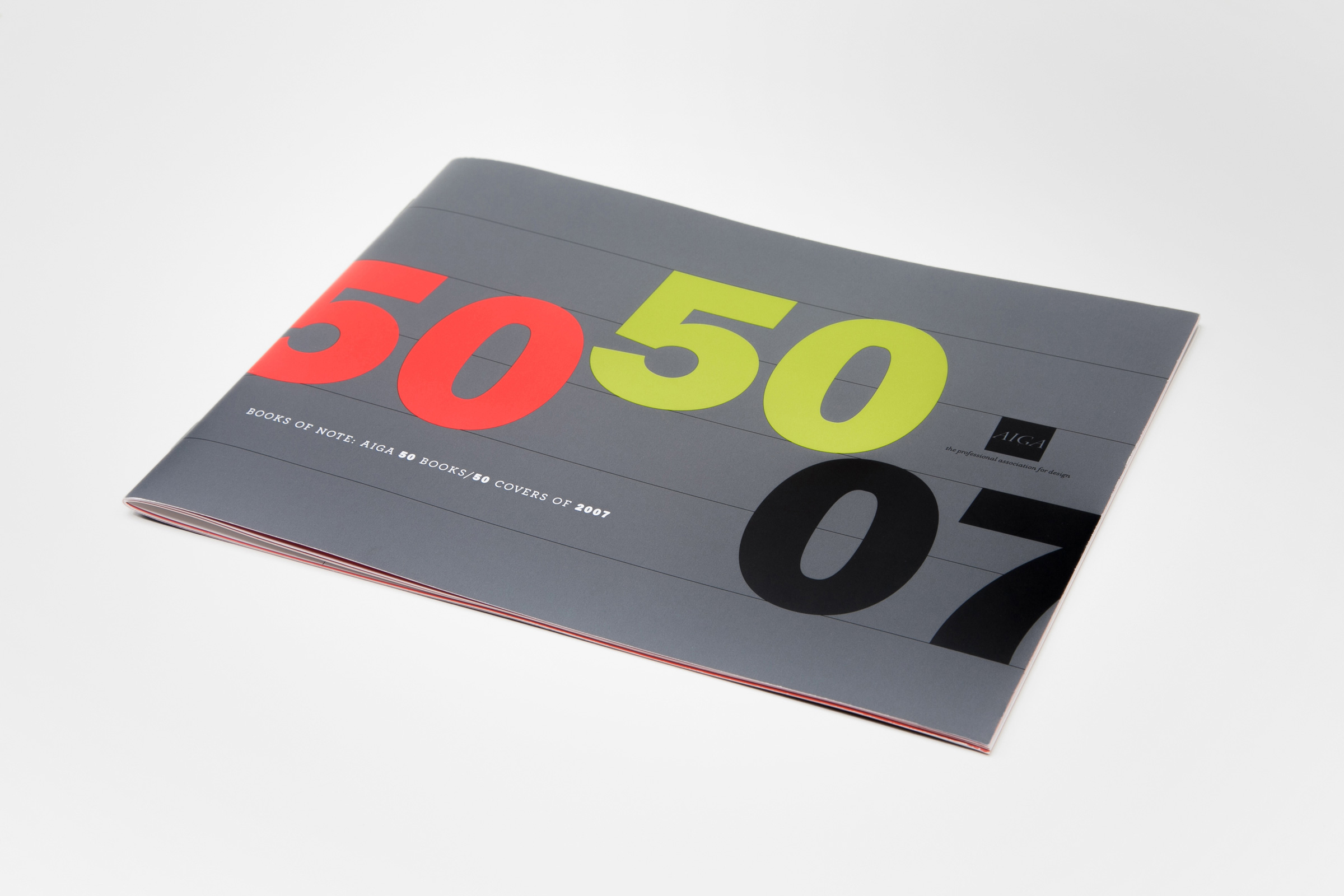
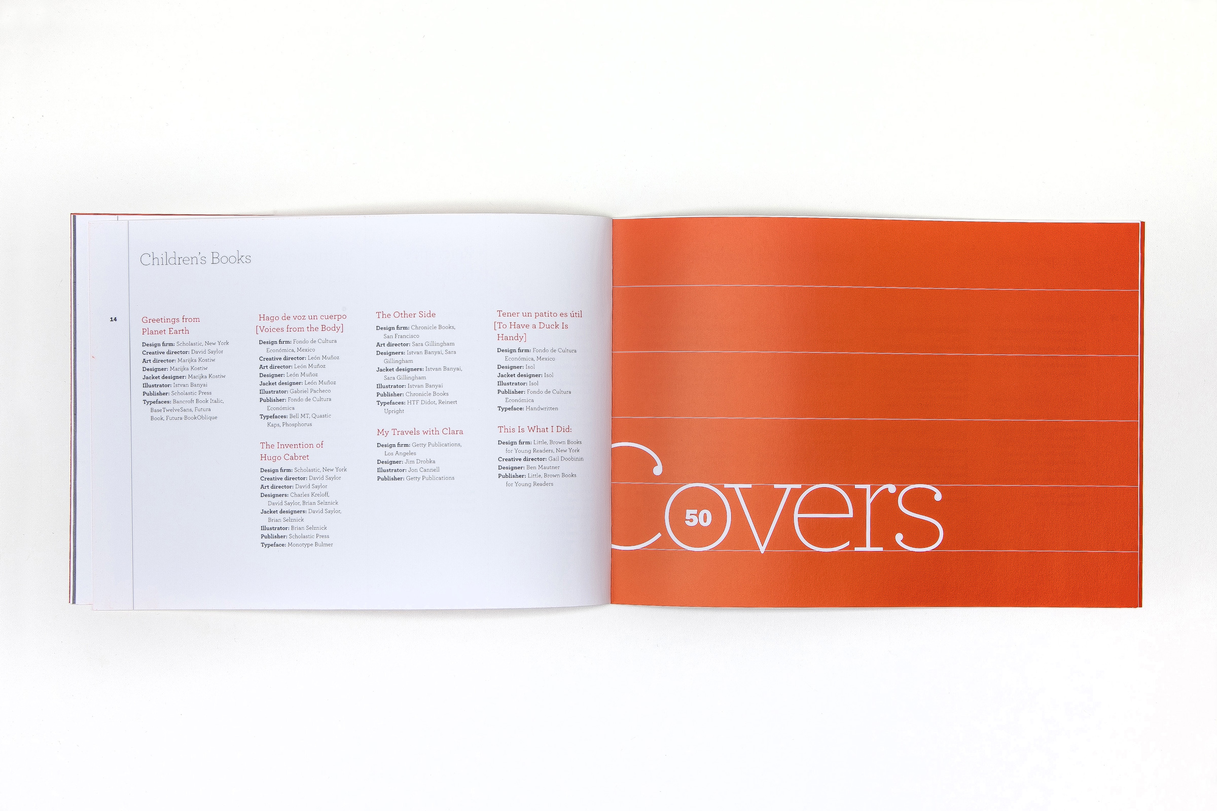
At AIGA’s headquarters in New York, “50 Books/50 Covers” — their most popular show — would feature the winning entries by the cream of the crop in book and cover design — each a shining example of conceptual originality and effective visual communication.
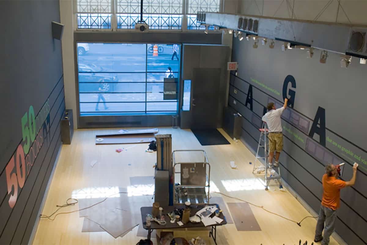
With a very short timeline, a very limited budget, and dealing with gallery floors that were being ripped up for renovation, we had our work cut out for us.
PROCESS
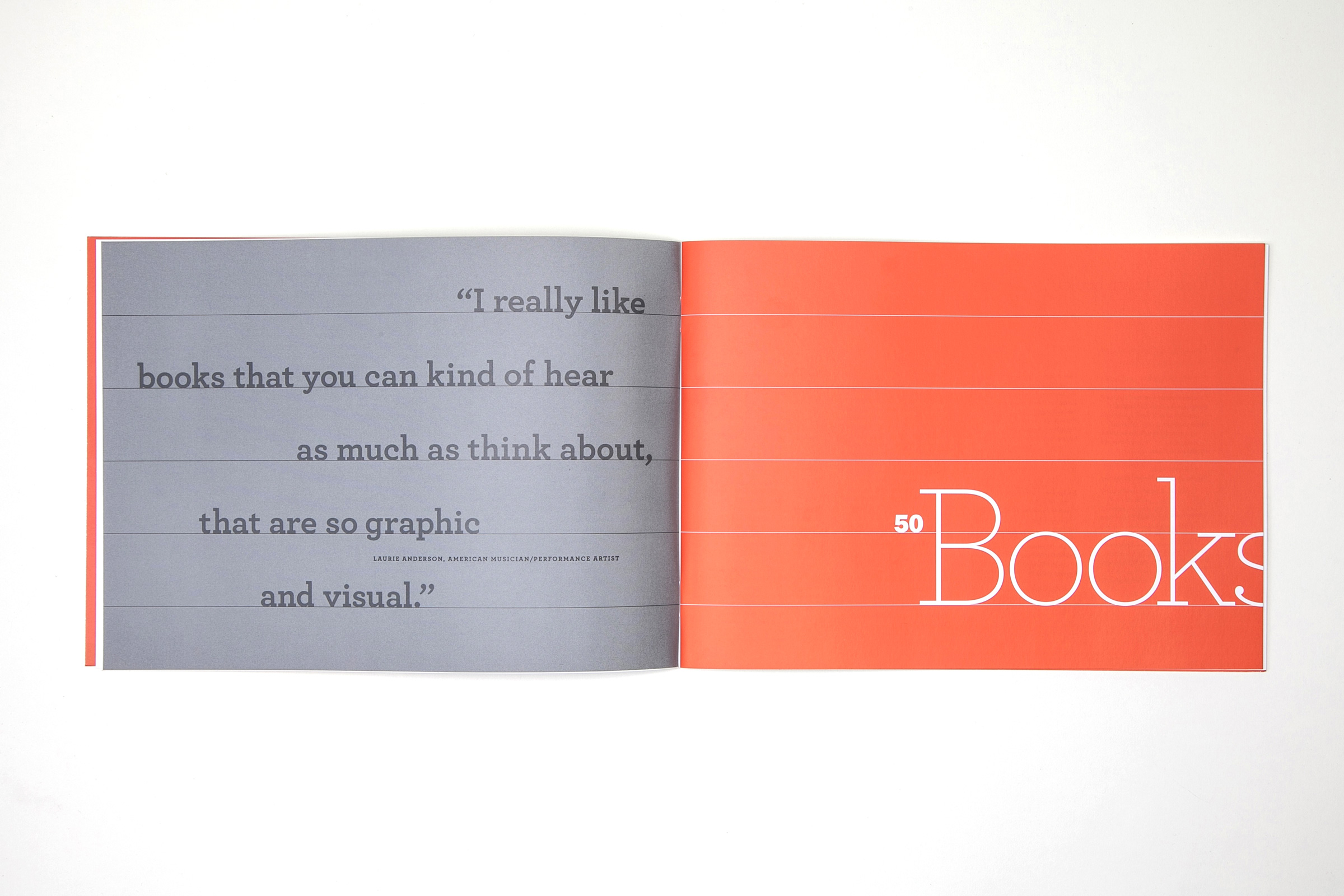
AIGA's leadership agreed that a concept encouraging visitors to interpret the exhibition as they wished would work well as an approach. In that spirit, we arrived at a musical metaphor:
1. A well-designed book is like a piece of music.
Whereas music is aural poetry, books are visual poetry. Both contain passages loud or soft, brash and dynamic, or serene and gentle. Music can be colorful. Books can be lyrical.
2. An exhibition of books is like an orchestra.
Each book could be considered an instrument with its own distinctive voice. The designer interprets a book’s content much as a musician would a piece of music.
3. Book design and music share terminology and qualities.
Both could be described as harmonious or discordant, rhythmic or expressionistic, exacting or interpretive. Both share terms like ligature, movement, volume, scale, and composition. Both have introductions, middle sections, and endings.
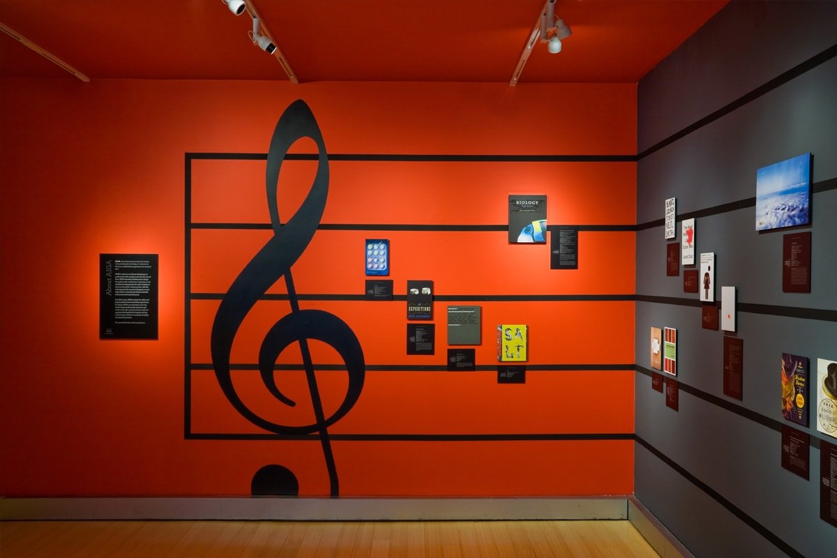
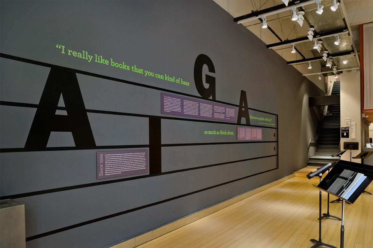
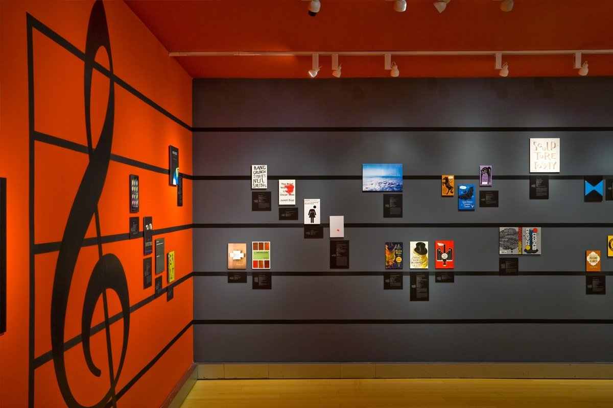
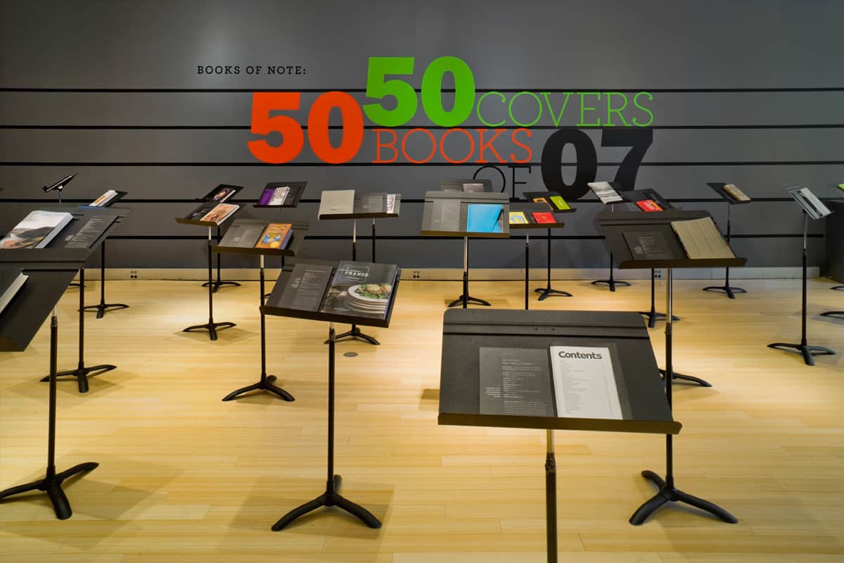
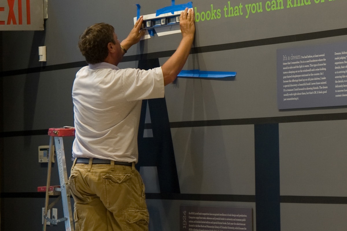
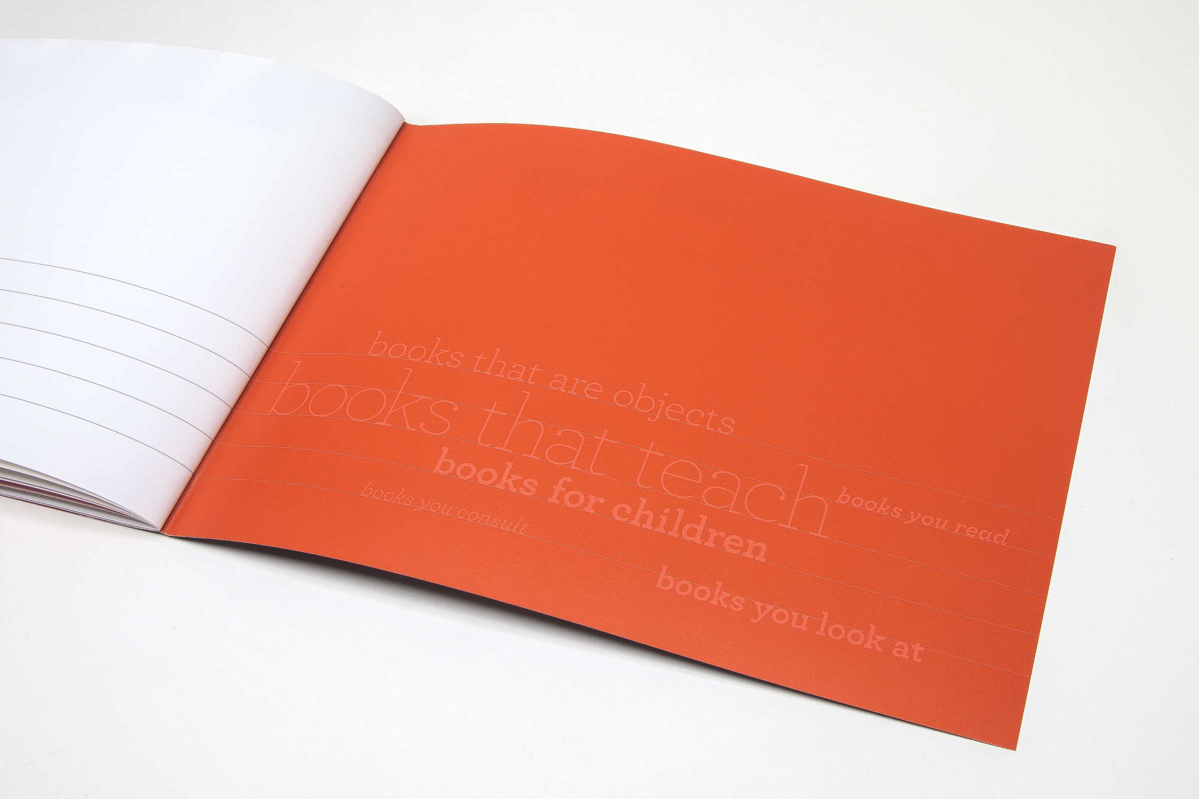
The visual expression of this metaphor involved wrapping the entire gallery in a musical staff. This design bound the two sections of the gallery together. For the book covers section, we arrayed covers and informational text panels on the staff like musical notation, guiding viewers through the works like tones of a melody. For the book design section, we displayed books on music stands, arranged on the floor like an orchestra — extending the musical metaphor and inviting viewers to interact with the books. To illustrate the concept further, we featured a quote from artist/musician Laurie Anderson: “I really like books that you can kind of hear as much as think about.”
RESULTS
With lines out the door, the exhibit opening drew a record number of attendees for any AIGA show in the 5th Avenue gallery space. For the months following, visitorship was high, bringing in professional designers, student groups, and the general public alike.
. . . . . . . . .
SERVICES
Creative direction | Graphic design | Exhibition curation | Motion design | Online advertising
TEAM
Creative direction & design: Marc Blaustein
Additional design: Ann Sappenfield


