


CHALLENGE
• Evolve logo for digital use
• Leverage historic equity
• Create visual identity system
The New York Public Library, the nation’s second-largest, consists of 92 neighborhood branches, four research libraries, and immense online resources.
As it evolved into a 21st-century digital library, the organization needed to revitalize its visual branding system. NYPL’s mission, audiences, and modes of doing business had all changed. It had become an indispensable global entity with multiple unconventional offerings, and more relevant to users than ever.
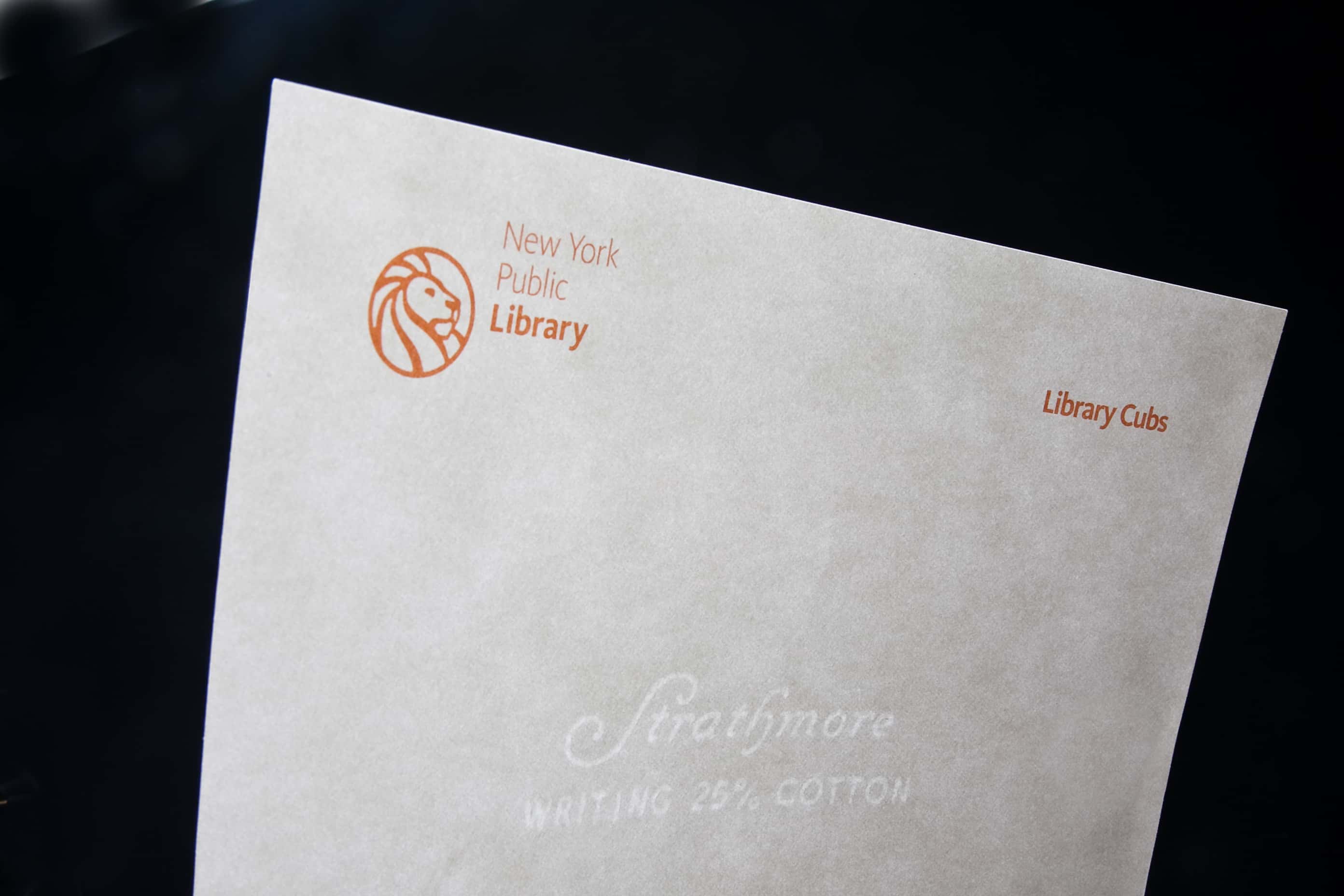
Informed by the findings of rigorous studies over several years, my team defined three key challenges: To update the logo for web use, to leverage the brand equity of the beloved lions while respecting their dignified bearing, and to use this logo as a starting point for a visual system reflecting a vital, forward-thinking organization.
PROCESS
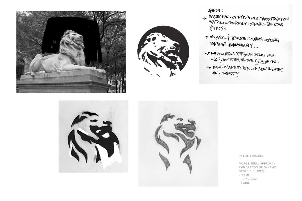
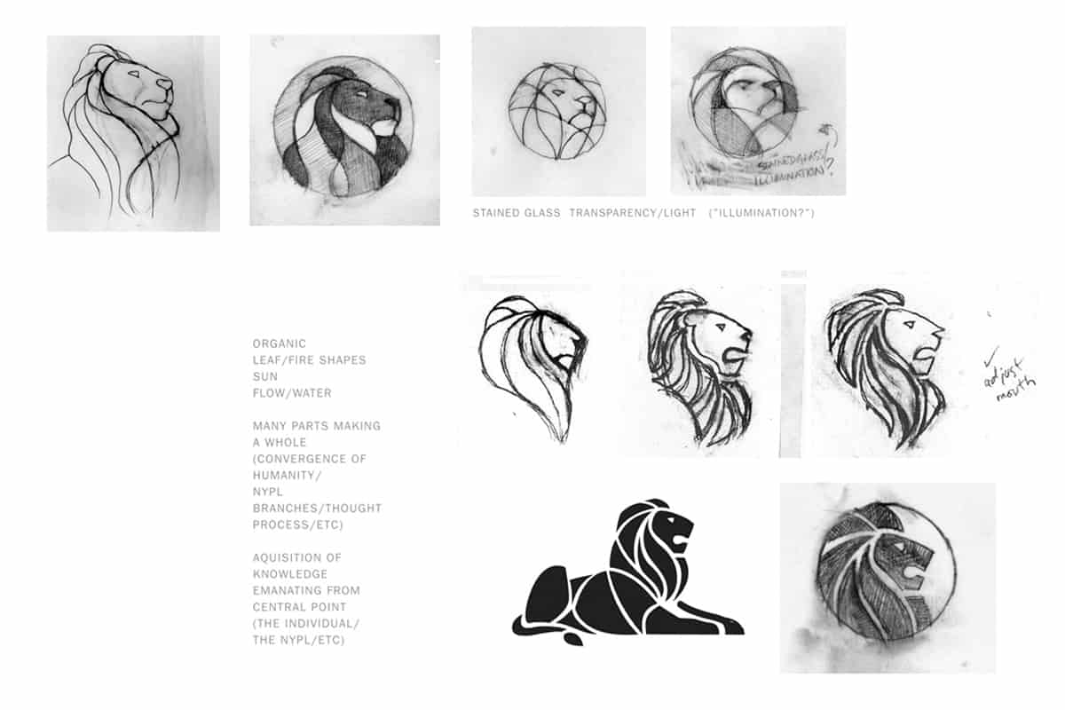
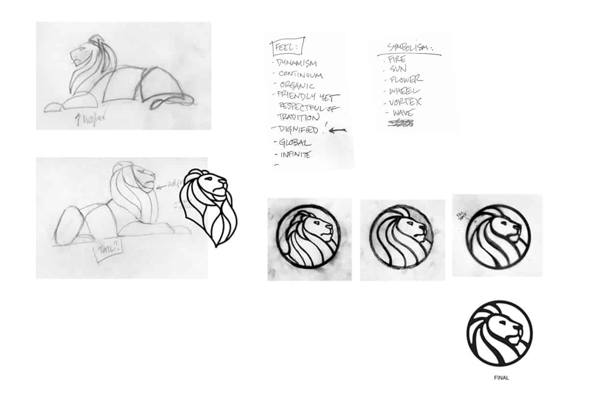
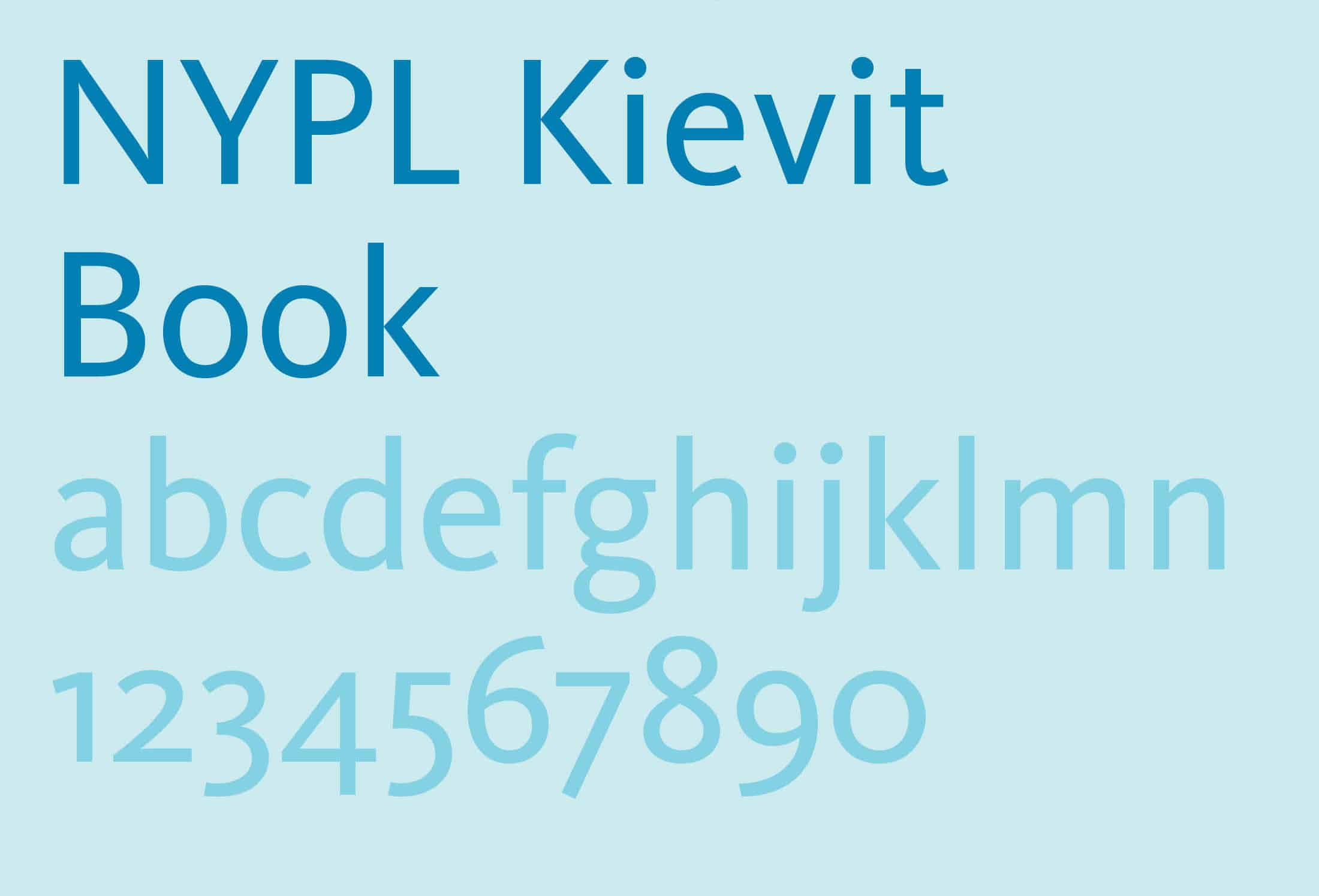
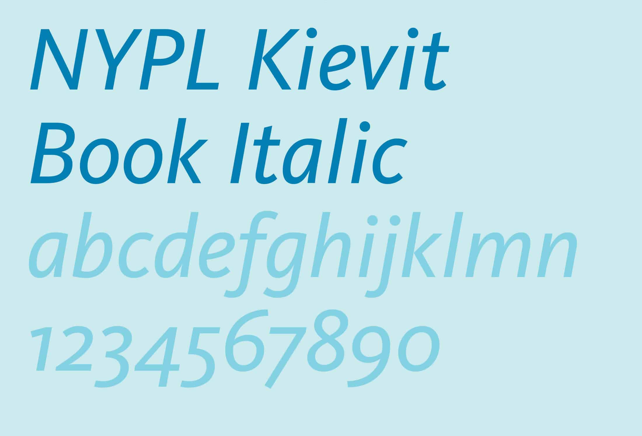
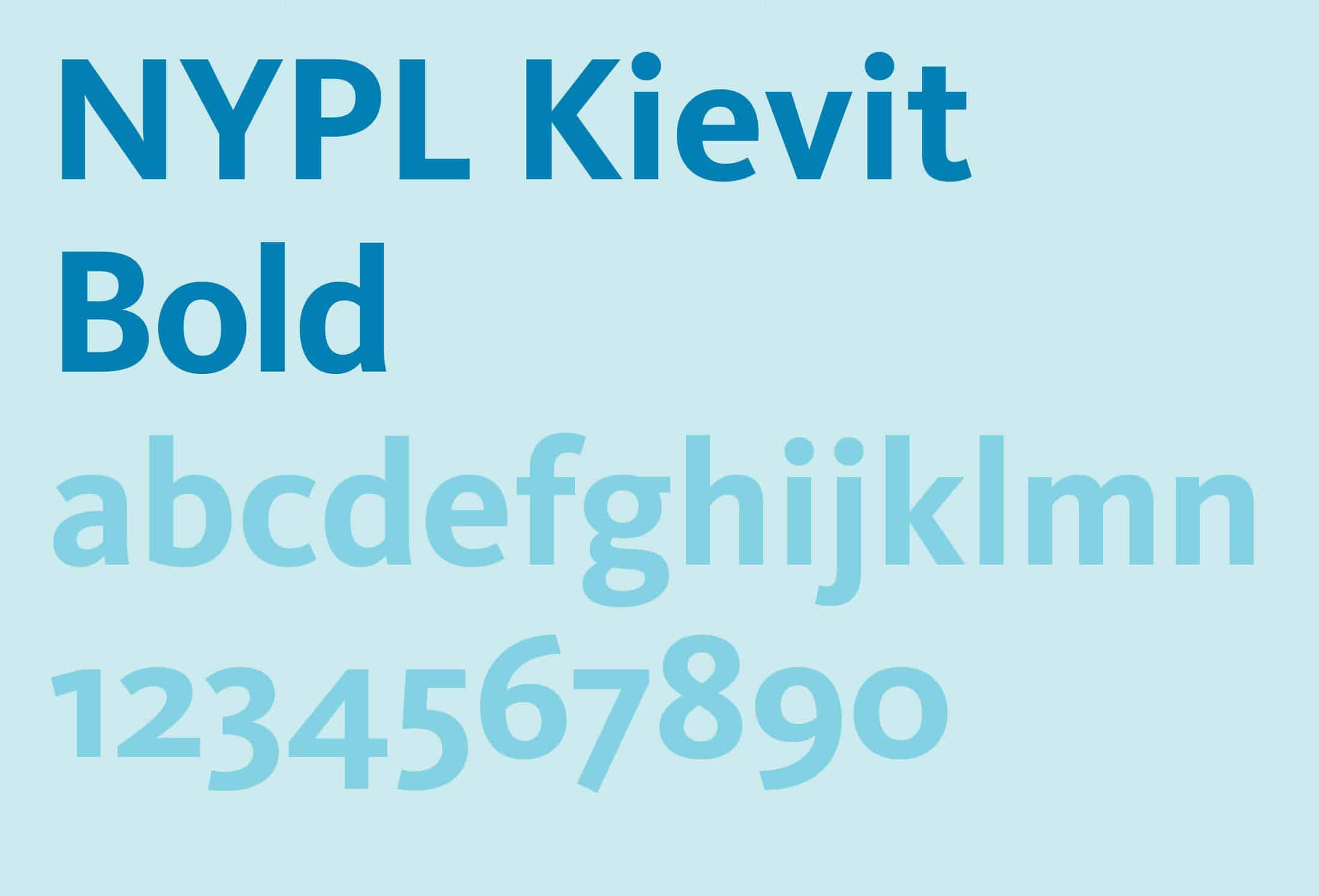
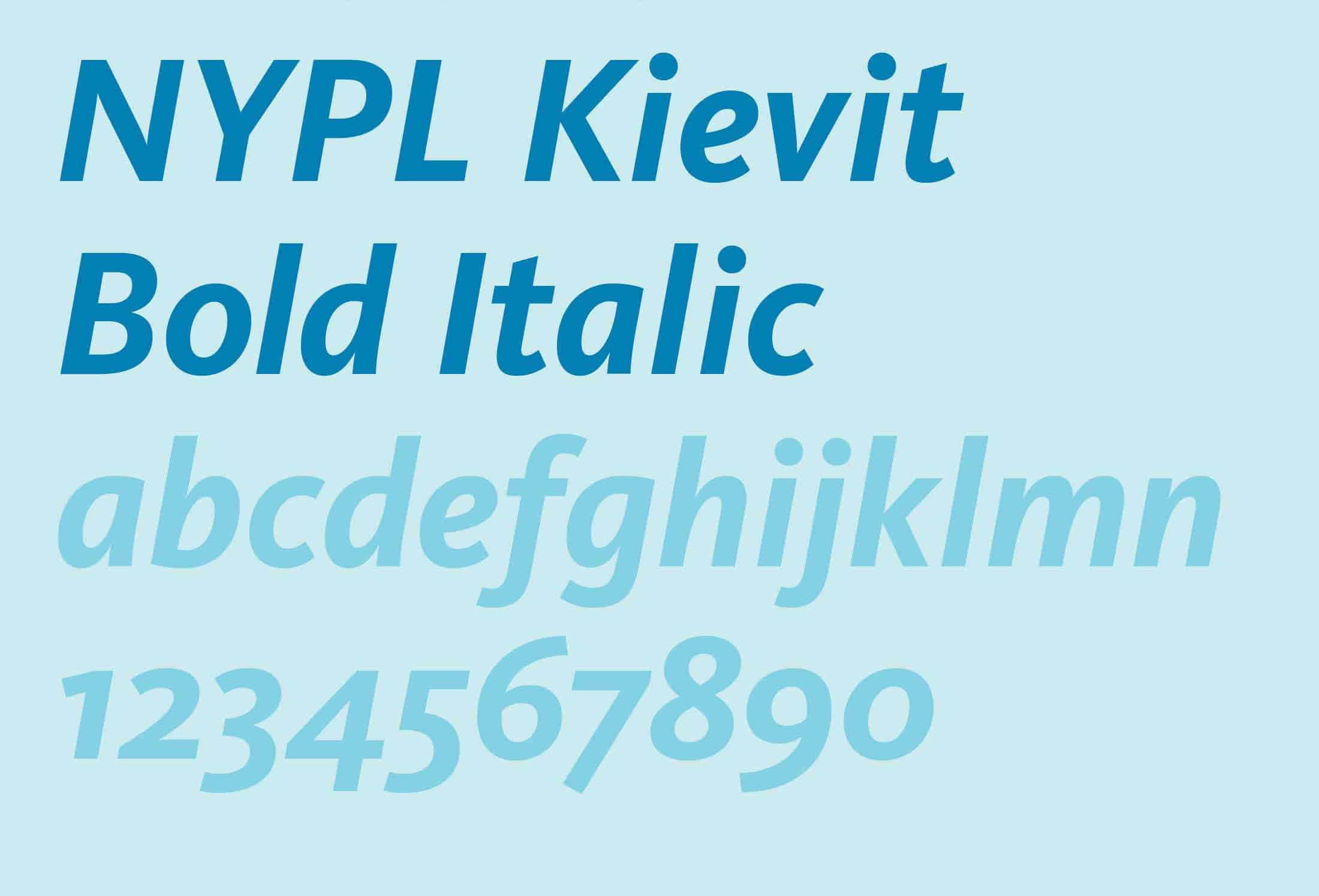
Launching a new identity system across a large organization can be difficult. To make transition easier, we eased new elements into the “drinking water” in stages. First, after much research and testing, we deployed a new customized typeface, NYPL Kievit. Second, we developed a refreshed color palette. Third came the logo. Leading the NYPL’s in-house design team, I explored dozens of concepts and made hundreds of drawings.
The initial inspiration came from 16th-century printers’ marks. Other stylistic influences were referenced: Art Nouveau, mid-20th-century graphic icons, Japanese woodcuts, and the formal and metaphoric qualities of stained glass, to name a few. However, we wanted to transcend any explicit stylistic and conceptual associations in the design, and evoke a 21st-century aesthetic. We created presentations showing four logo concepts in a wide range of applications. After extensive feedback from internal stakeholders, and public review, we refined the logo further.
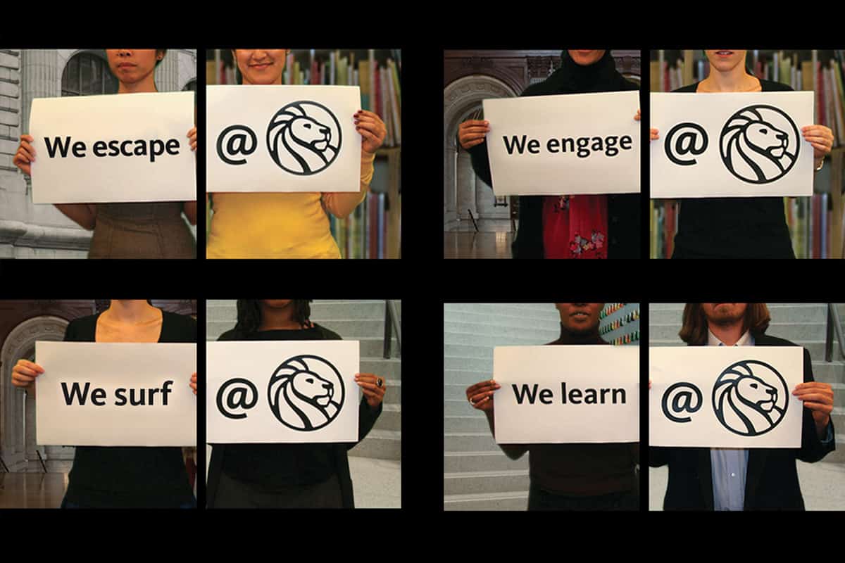
The new mark was unveiled at a party that included a presentation by renowned design critic Steven Heller. We showed three promotional videos that we created for the event that highlighted how the logo related to the NYPL's new mission statement.
RESULTS
Response to the new identity, and especially the new icon, was enthusiastic. It was embraced not only by the NYPL’s staff, but more importantly by the public. The logo received notice in a variety of publications including The New York Times and the Wall Street Journal. It garnered design awards and was featured in design books. Brand New, the leading online design journal, ranked it among its best identities of the year. To top it all off, the Smithsonian/Cooper-Hewitt National Design Museum and Walker Arts Center included it in a massive traveling exhibition.
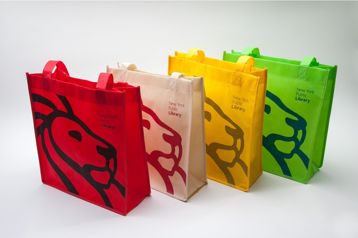
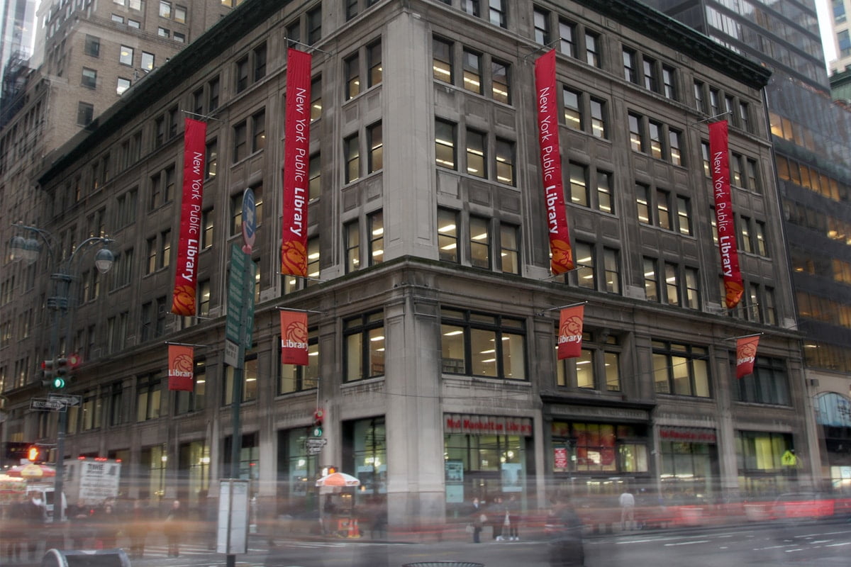
The new lion icon and identity system have become a powerful presence across New York City, reinvigorating the NYPL brand. The logo’s instant recognizability and ubiquity has helped foster connection between New Yorkers, tourists, and the Library system. The identity has proven effective in presenting a dependable, populist organization—one that serves a democratic society, offering free, equal access to information to any and all people.
SERVICES
Creative direction | Graphic design | Branding/Identity | Illustration
TEAM
Creative direction & design: Marc Blaustein
Additional design: Katharina Seifert, Matt Poor, Daniel Um


